My branding work stems from a place of human-centered design, even when I'm designing for an AI client. If you're intrigued, read on.
Brand and Logo Design
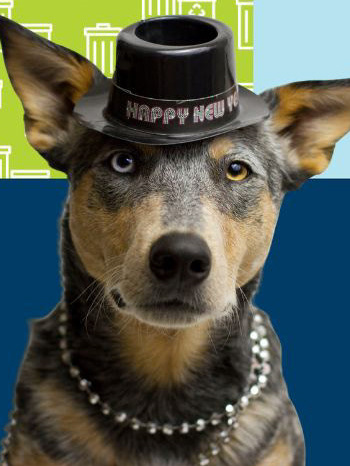
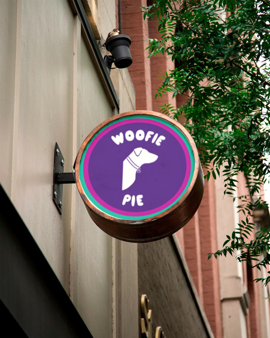
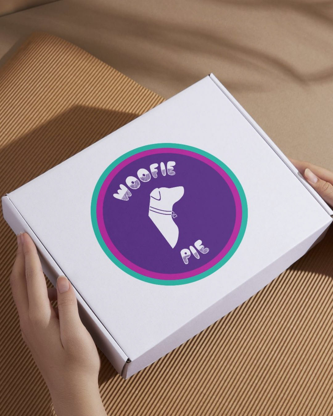
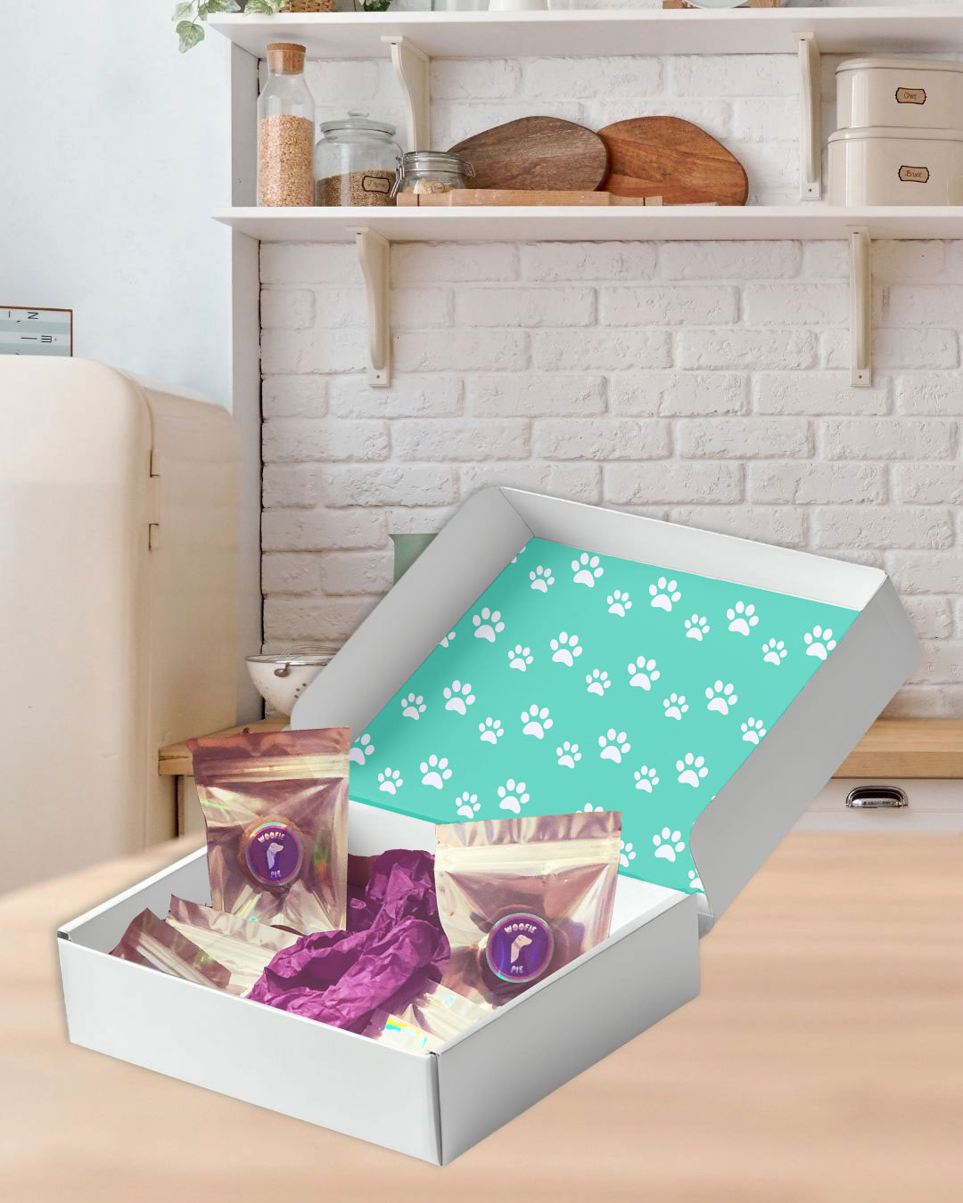
As its founder, I built Woofie Pie from the ground up. After perfecting the recipe for a "dog treat so good a human could eat," I began to build the brand. With the dog who inspired the business as the muse for its logo, and a target audience of Millennial dog parents in mind, I traveled back in time, creating a mood board that drew inspiration from the late 90s. The branding was informed by colors, elements, and textures from my own childhood to create a sense of nostalgia, featuring bright colors and the bubble font nearly every Millennial middle schooler practiced on their Trapper Keeper.
Brand Standards and Oversight
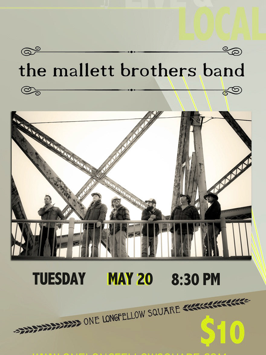
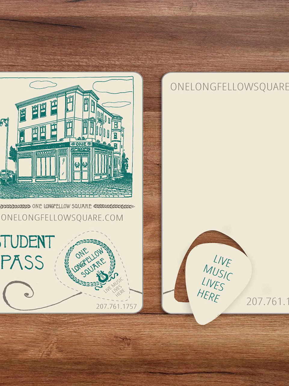
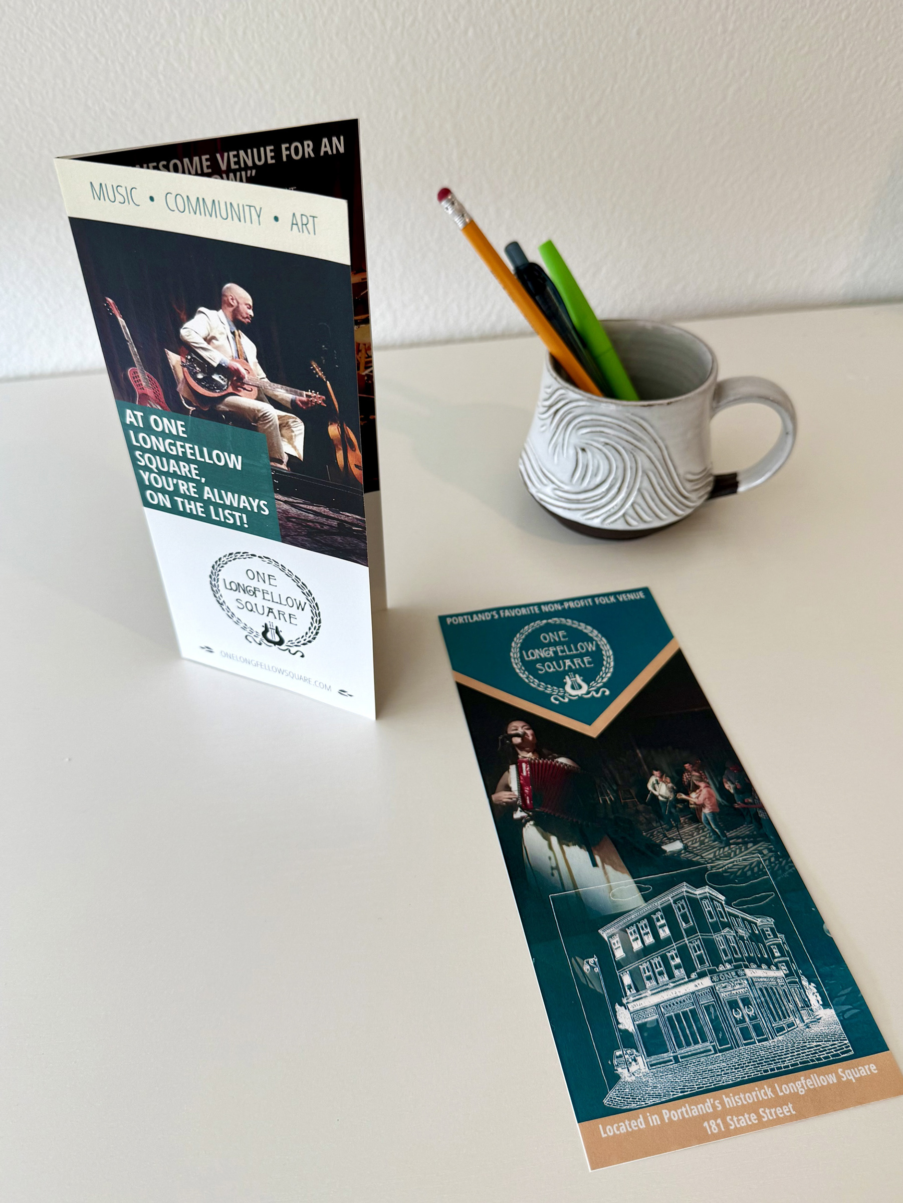
As Marketing Director for One Longfellow Square, I faced a unique challenge: develop a strong, cohesive brand identity and marketing materials on an extremely low budget. I embraced the opportunity by creating a custom brand kit with colors inspired by the venue’s historic building, tone drawn from its Americana roots, and fonts informed by its existing logos. To reduce printing costs, I designed templates that maintained visual consistency across all materials but could be printed in-house on a standard inkjet printer. Limited funds were reserved for high-impact pieces, such as large-format signage and custom membership cards featuring pop-out guitar picks. The refreshed branding helped reduce expenses by 36%, while increasing ticket revenue by 12% and growing contributed income by 30%.
To view the complete set of brand standards, click here.
Logo and Business Card Design
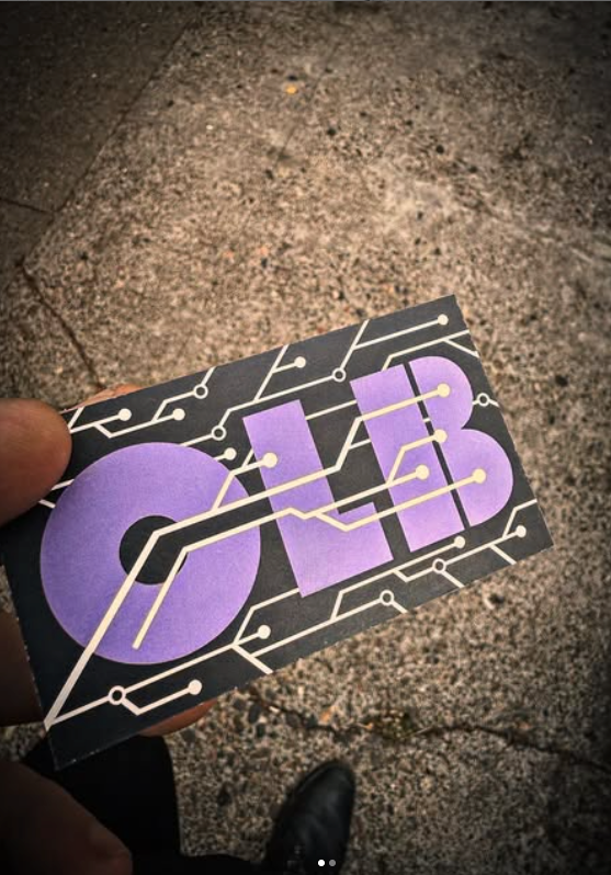
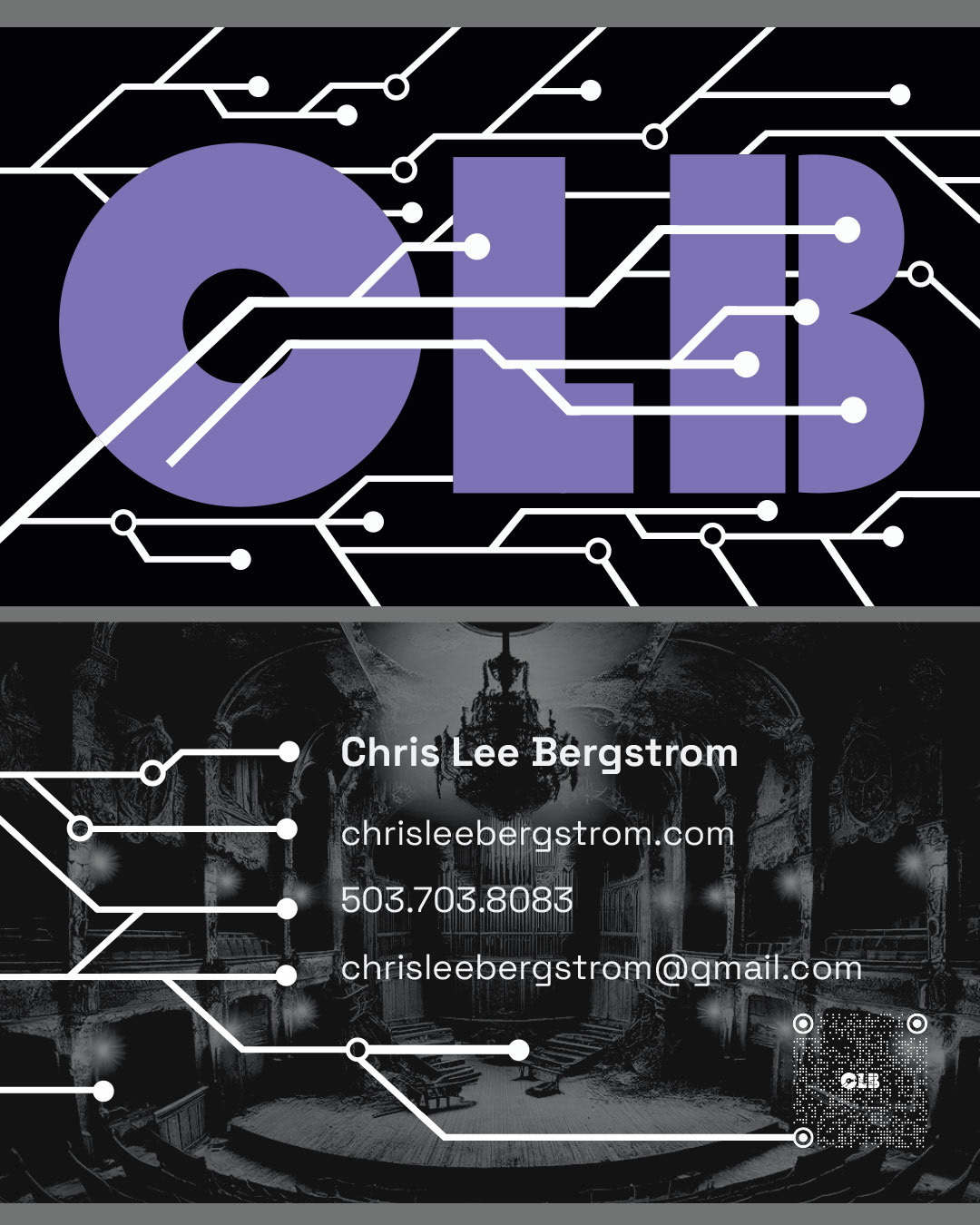
AI in design is a major topic at the moment. As someone actively studying the subject, when CLB Consulting approached me to design a logo for the website they had recently constructed with the help of AI, I was intrigued. The client provided me with three items as inspiration: their bot-built website, a specific shade of purple, and the word "Brutalist." The company aims to provide AI consulting within the arts and entertainment sector, so I built a mood board and began sketching with that information and the elements provided by my client in mind. Drawing from the architecture of the Brutalist era, theaters, and the concept of robotic human connection, I crafted a logo incorporating elements of circuitry running through large, block lettering, reminiscent of lights in a venue or veins flowing through a body.
