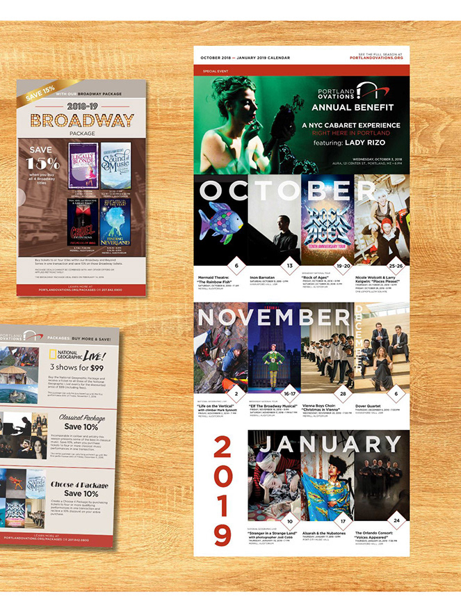
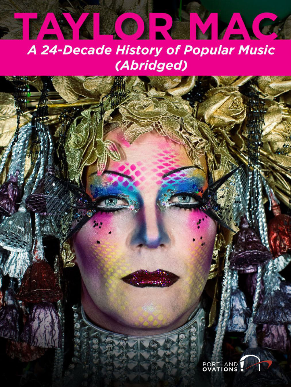
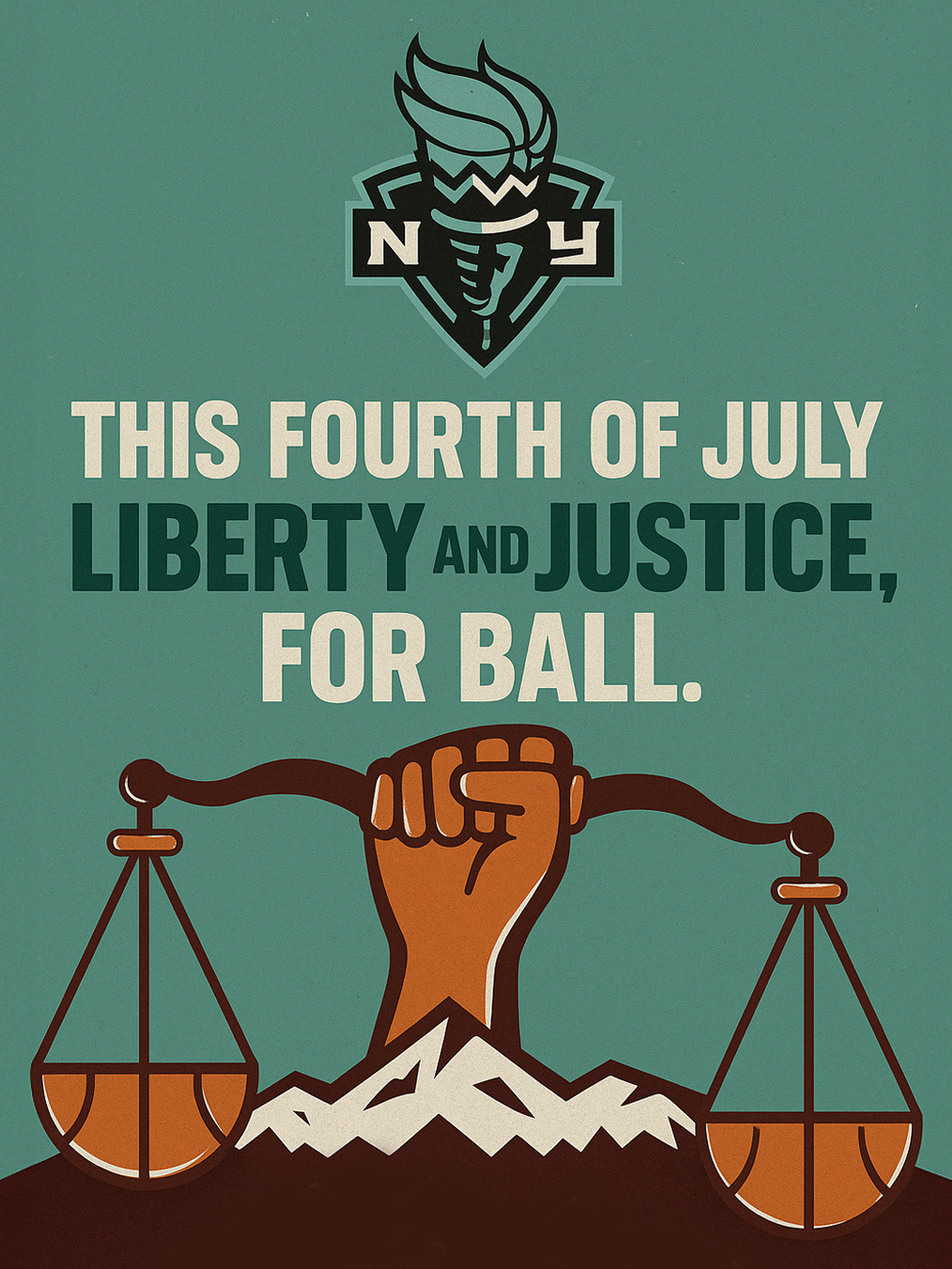
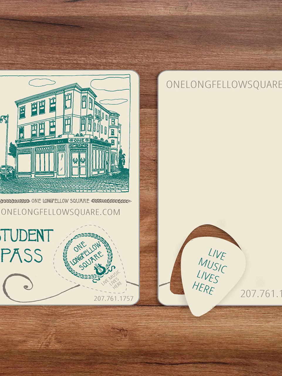
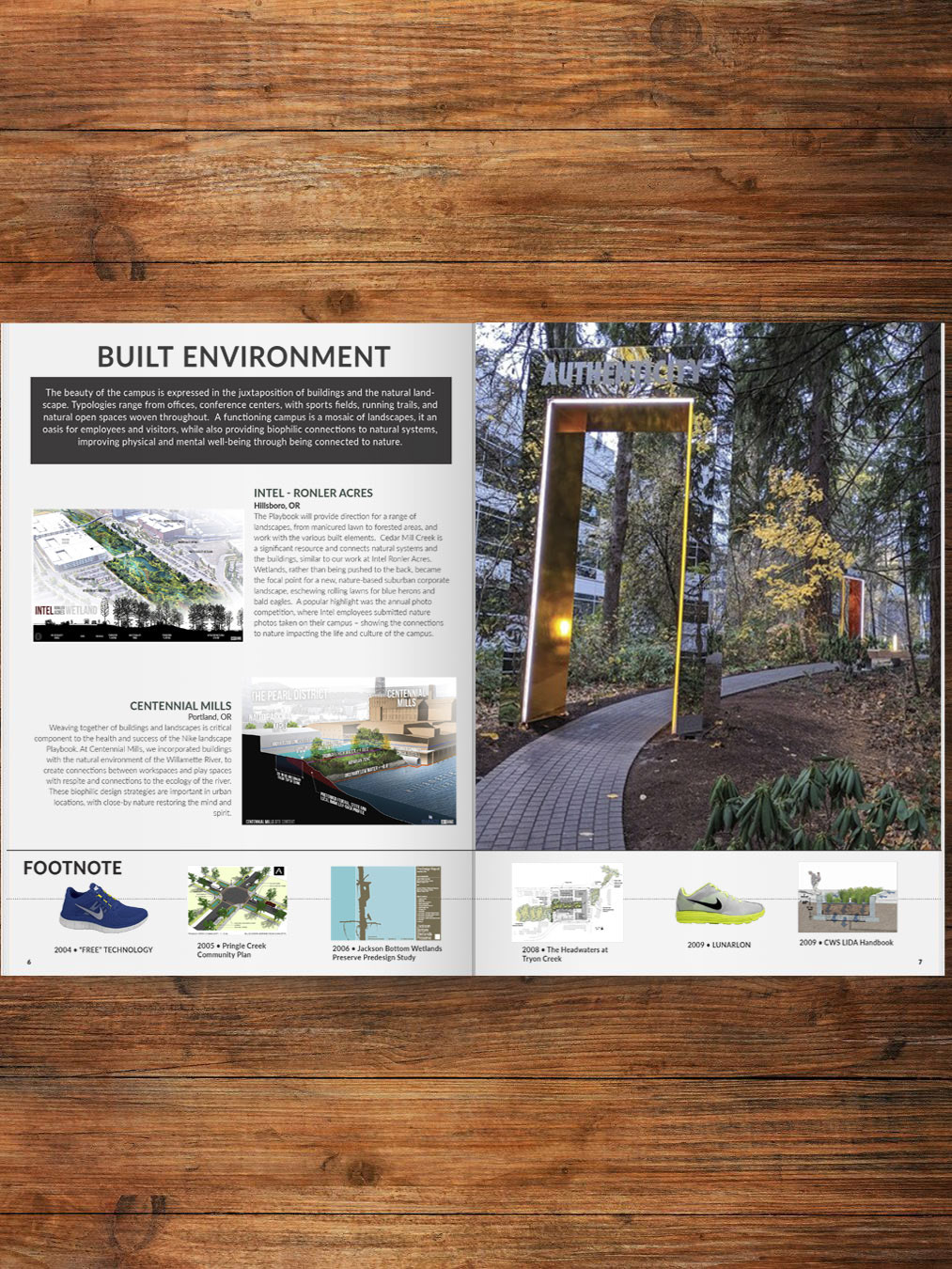
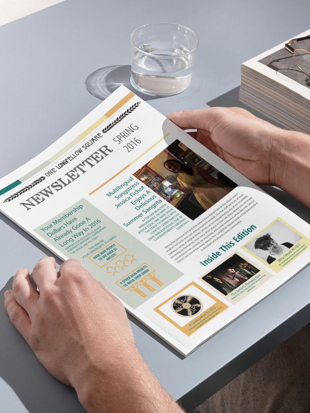
When I started as a Senior Visual Communications Designer at Portland’5 Centers for the Arts, the organization had a solid brand identity with unique sub-branding across its five venues. However, materials were being produced by staff from all departments and lacked brand cohesion. In addition to serving as creative director on projects and designing promotional materials using the Adobe Creative Suite of products, I built a comprehensive brand kit in Canva, complete with templates, making it easier for staff with varying levels of design experience to create branded assets. I then led a cross-departmental training on the organization's branding and how to use Canva and the brand kit to ensure cohesion across all materials produced.
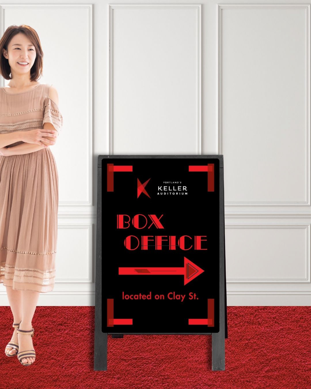
Branded Signage
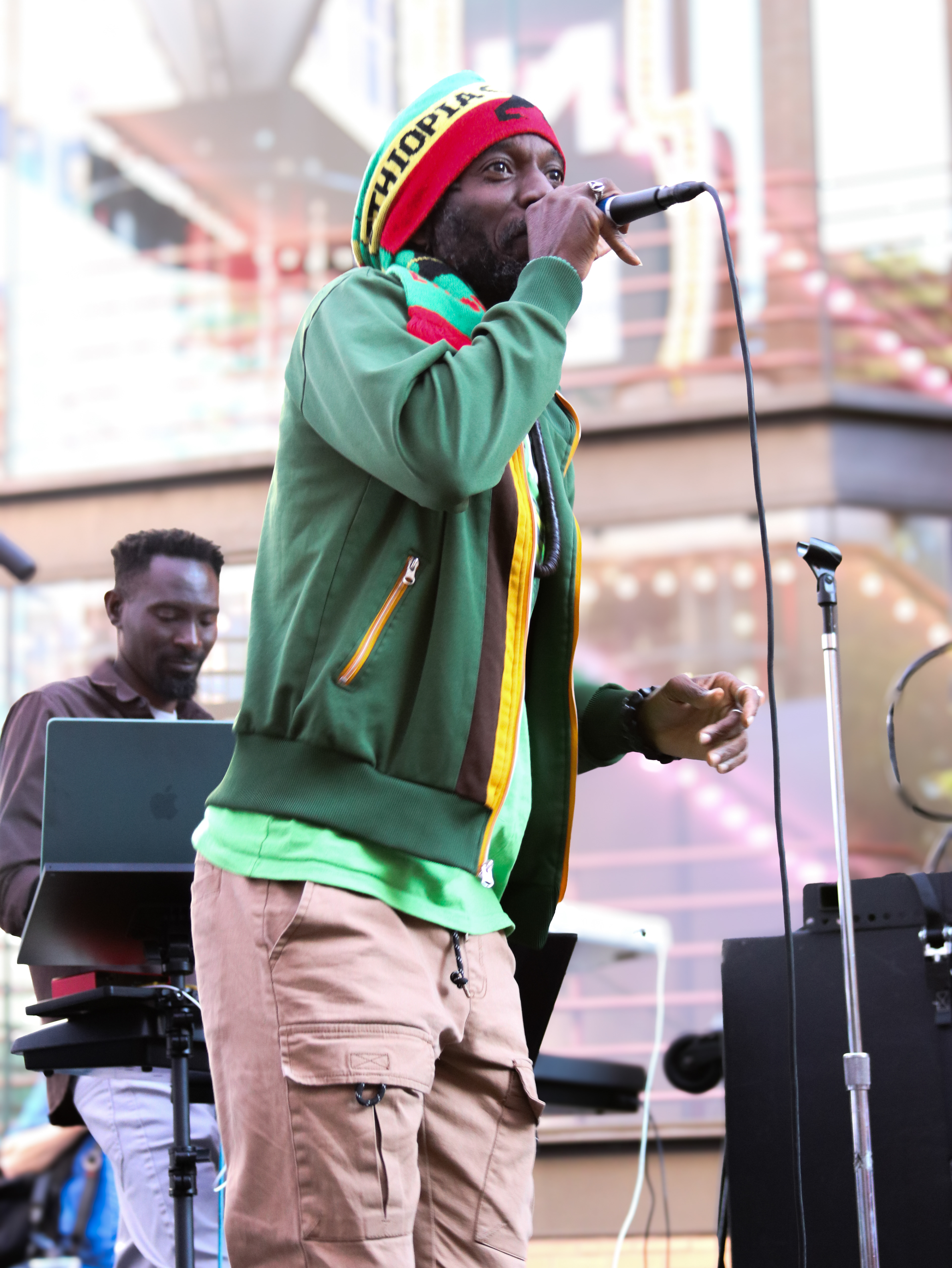
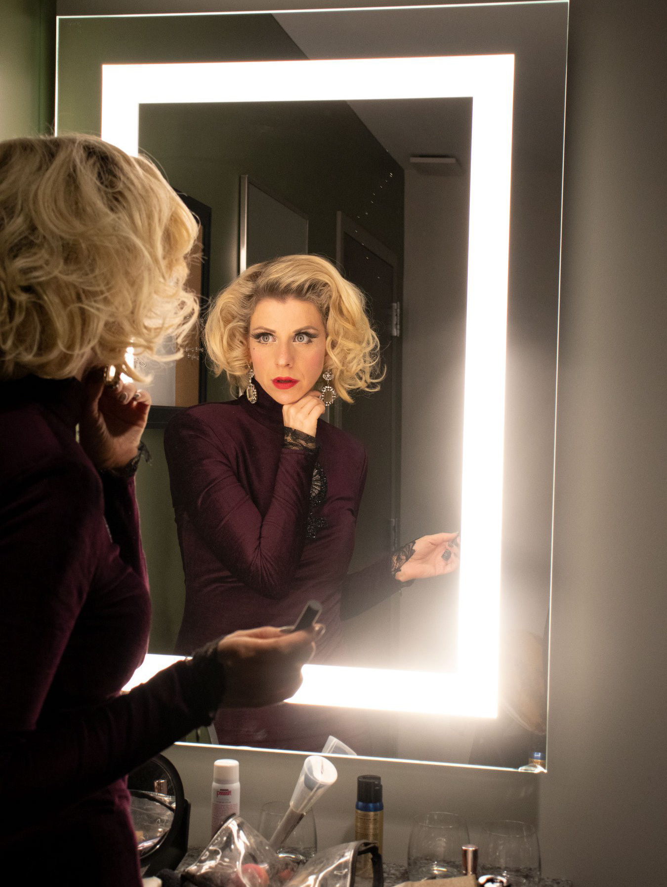
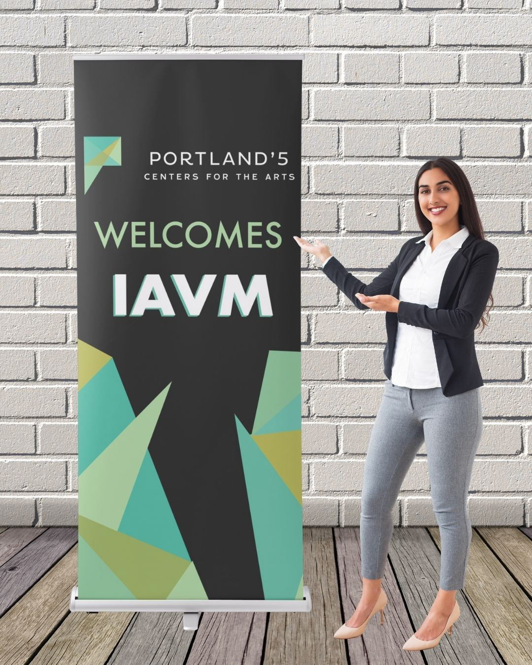
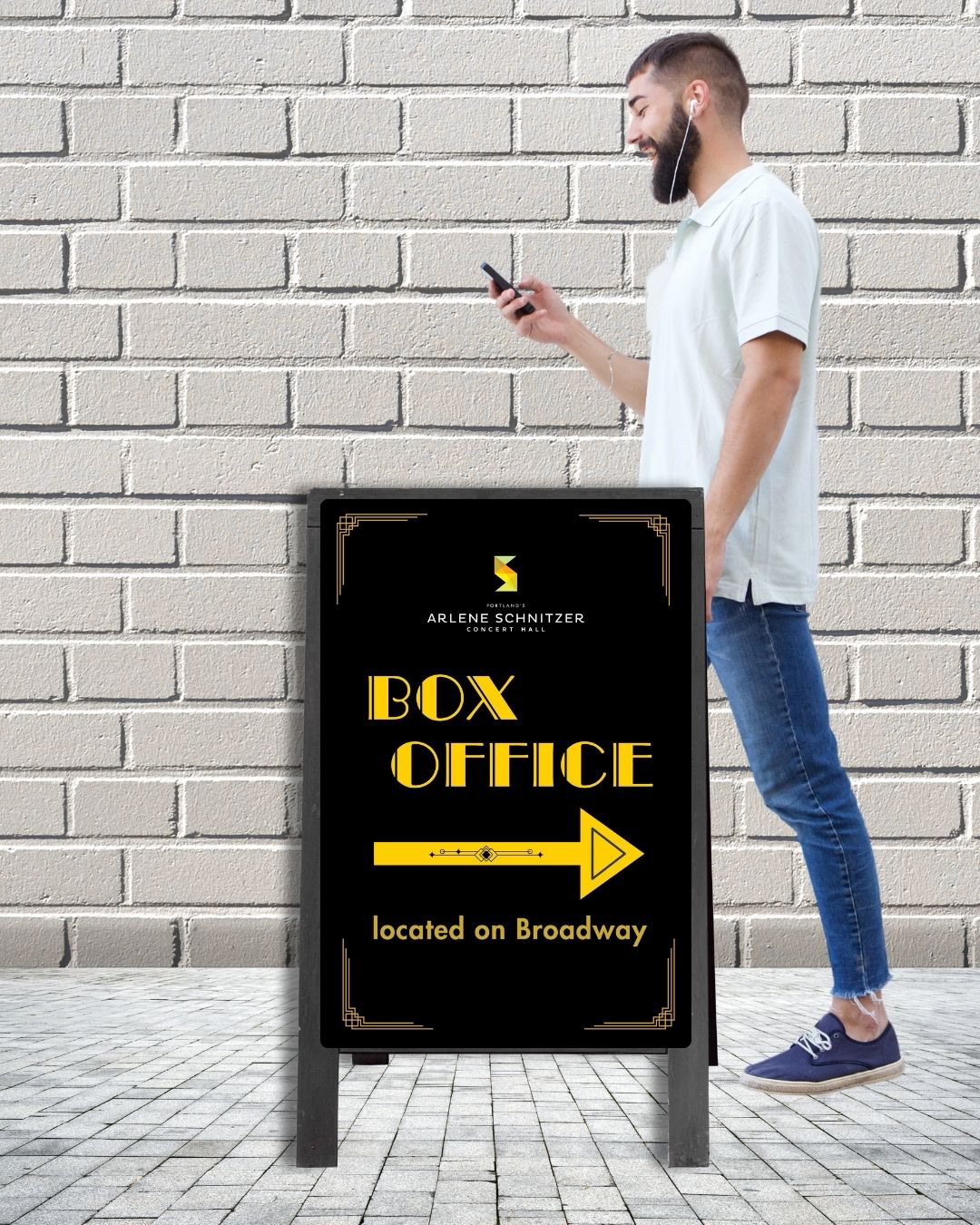
These actual, totally real people want to show you banners and sandwich boards I designed using Illustrator, InDesign, and Canva to reflect the overarching Portland'5 brand and its venues' sub-brands.

Large Scale Long Term Posters
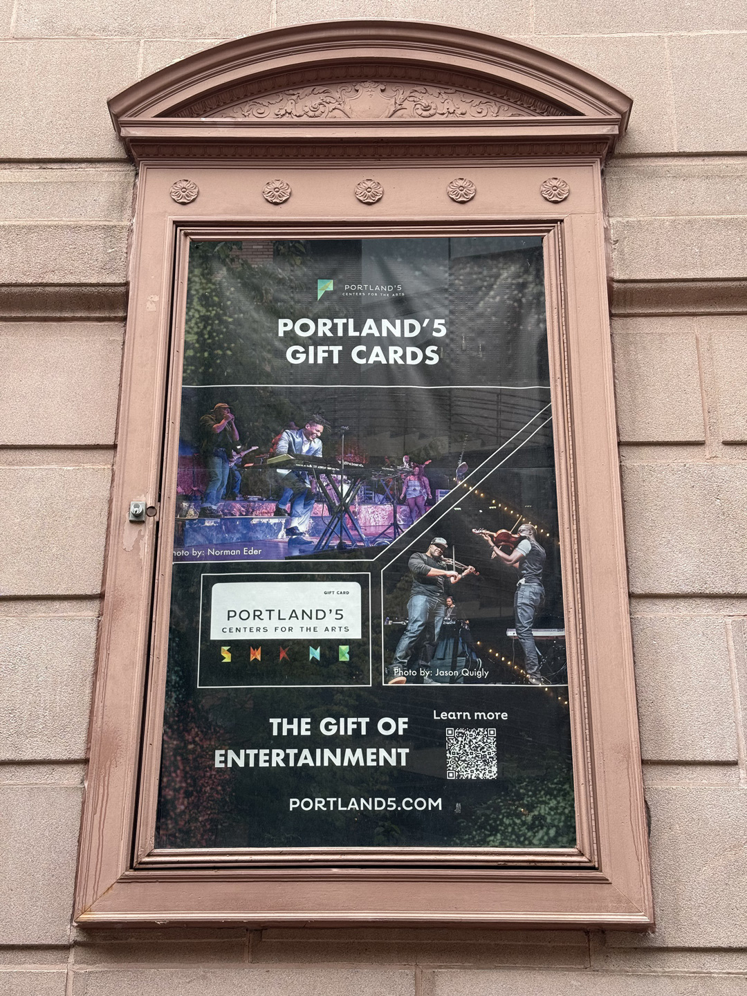
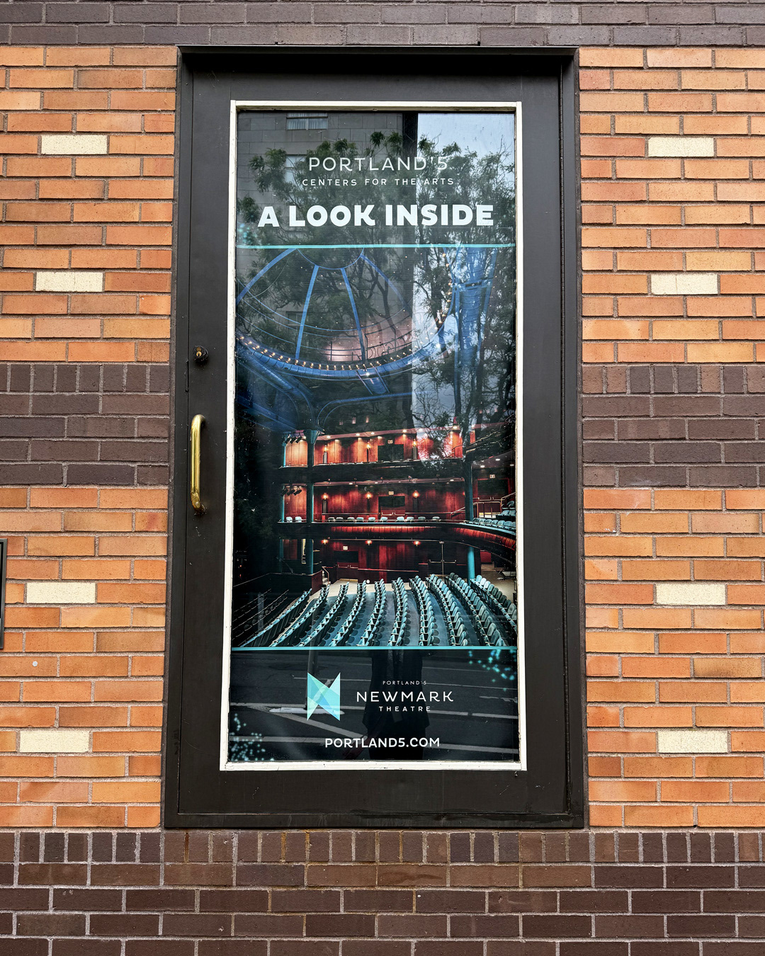
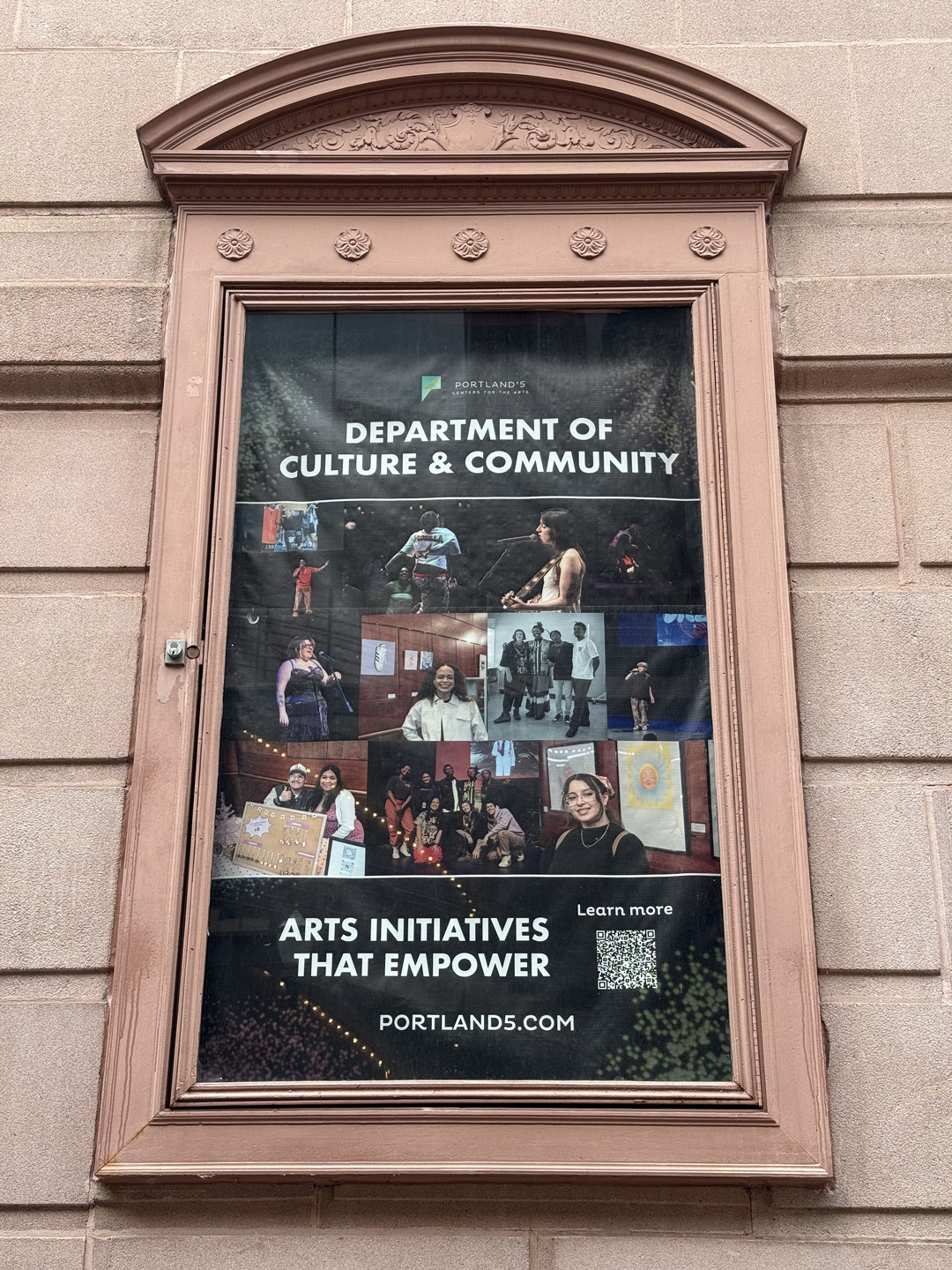
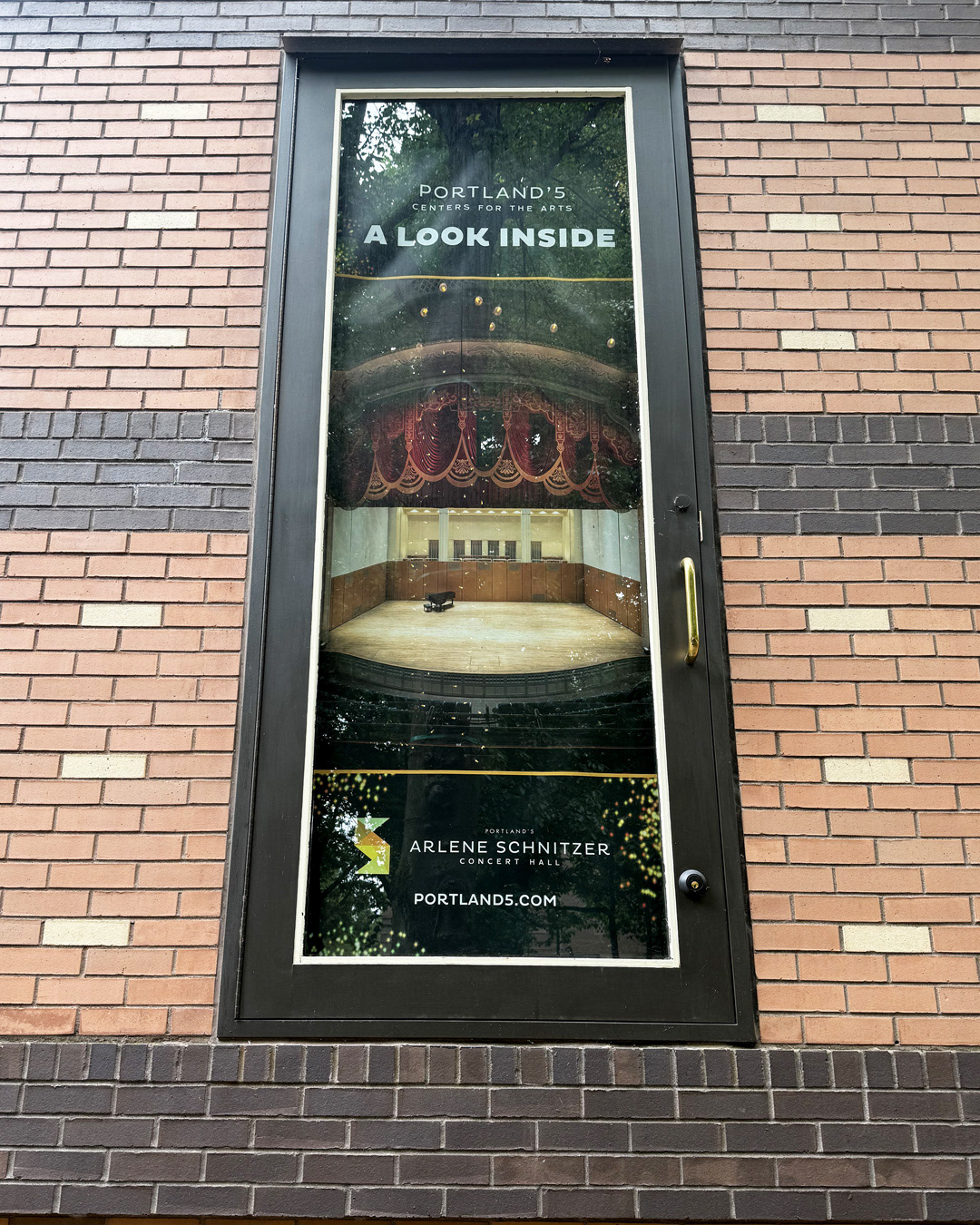
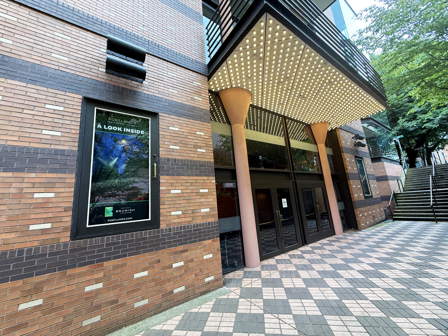
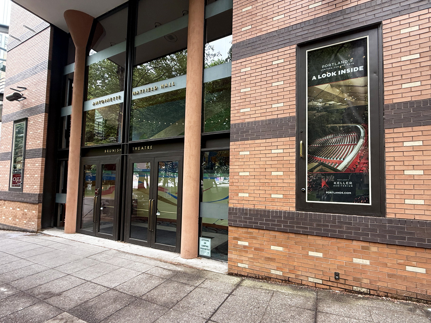
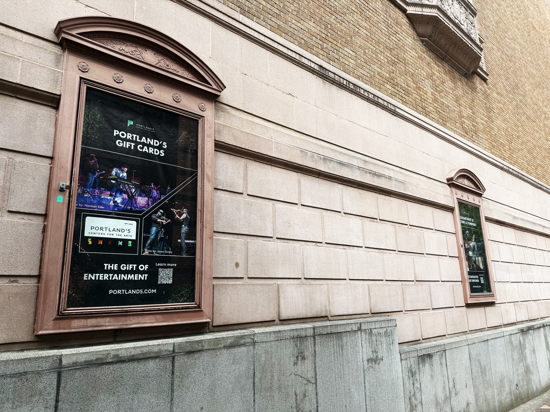
When Portland’5 faced the challenge of filling a set of uniquely sized cases on two of their historic buildings—with signage that needed to withstand at least one year of classic Pacific Northwest weather—I stepped in to lead the project. Using Procreate, Photoshop, and InDesign, I designed artwork featuring venue photography, performers, and youth from their Culture and Community programming. I presented several concepts to the Marketing Director and partnered with a local printer to address the unique sizing needs and to source materials tough enough to withstand the elements. From design through installation, I coordinated with the facilities team to ensure every piece was perfectly sized and placed. The result was a series of posters that allowed passersby to experience the inside of the organization from the exterior of its buildings.
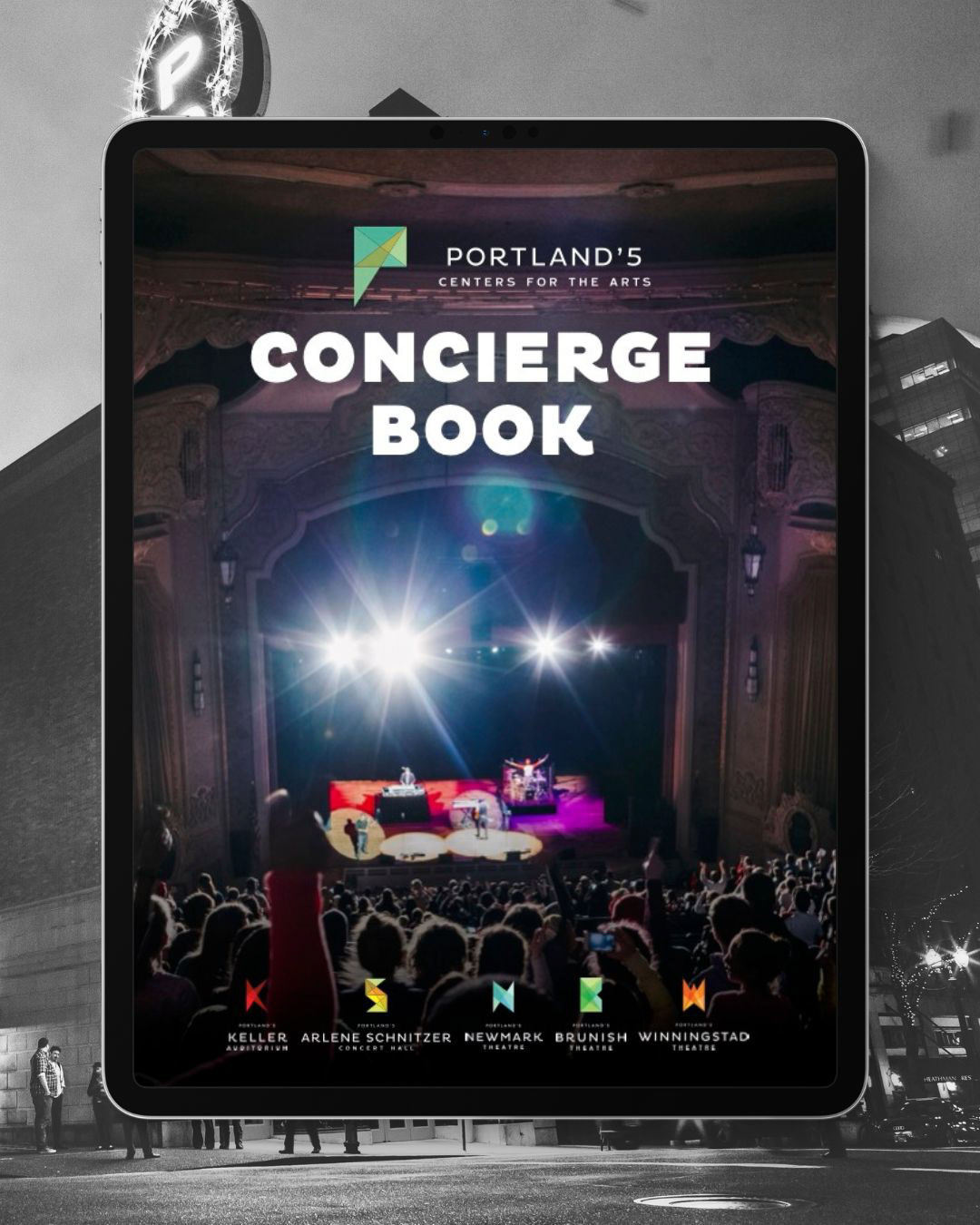
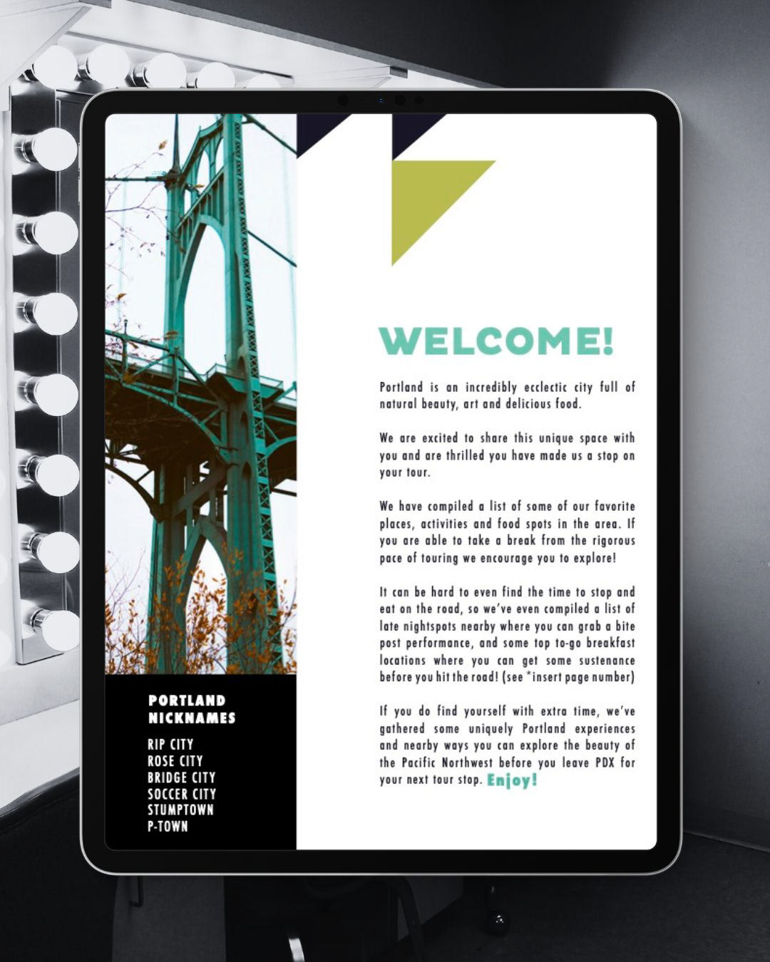
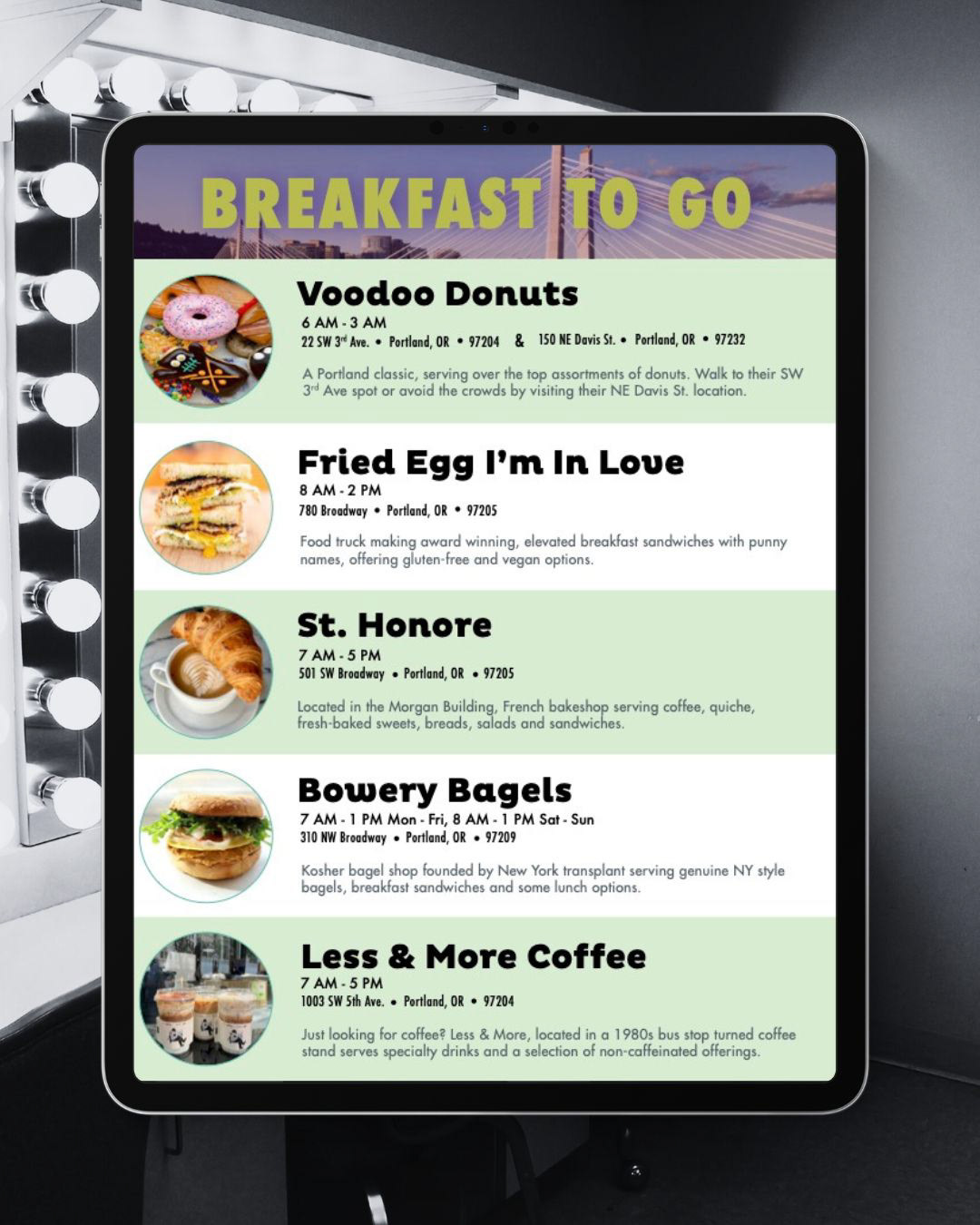
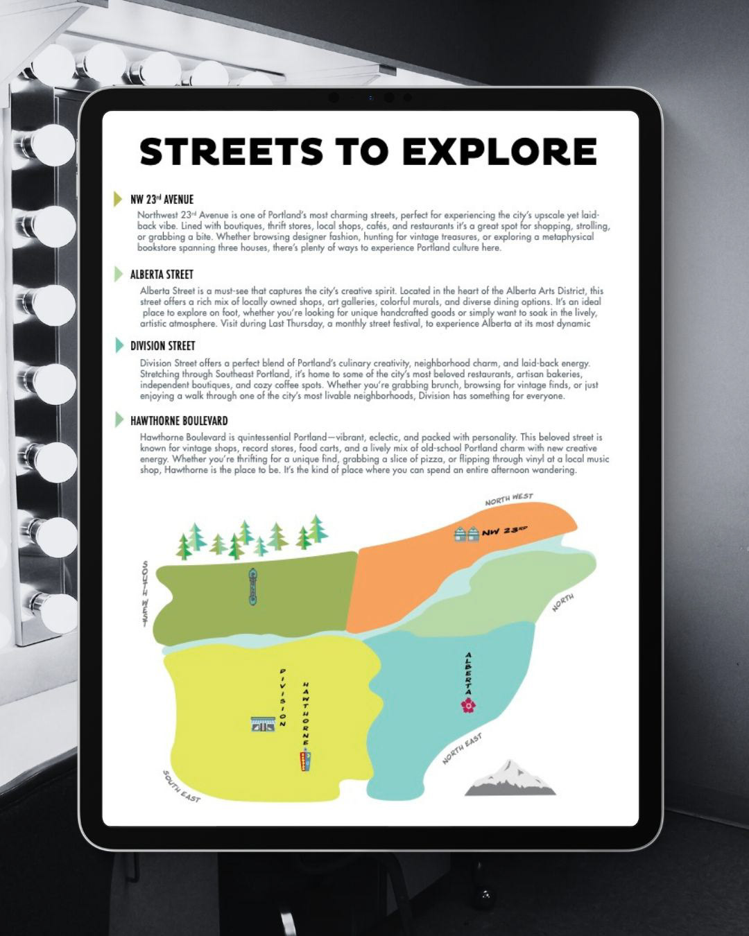
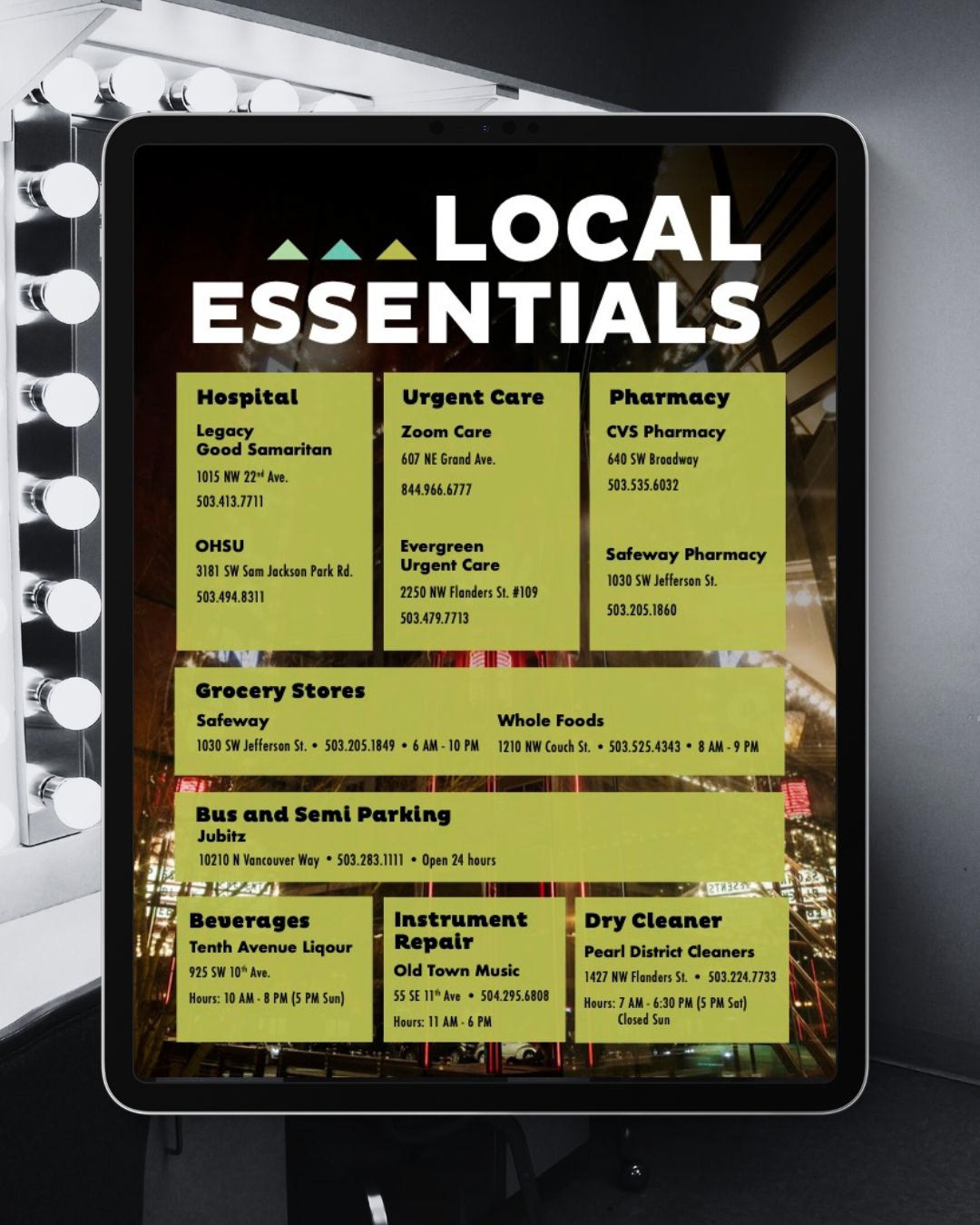
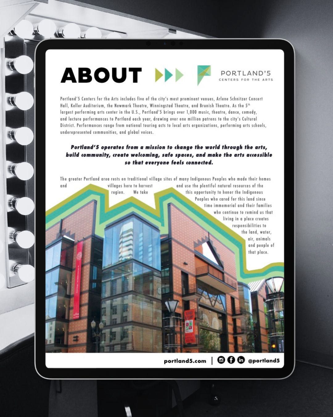
Digital Concierge Doc
When asked to create a digital, concierge book for Portland'5 touring artists, I wanted to produce more than a simple document. I used Photoshop, Illustrator, and InDesign to craft a magazine-like digital resource that highlighted the vibe of Portland, OR, through the lens of the Portland'5 brand.
Social Media
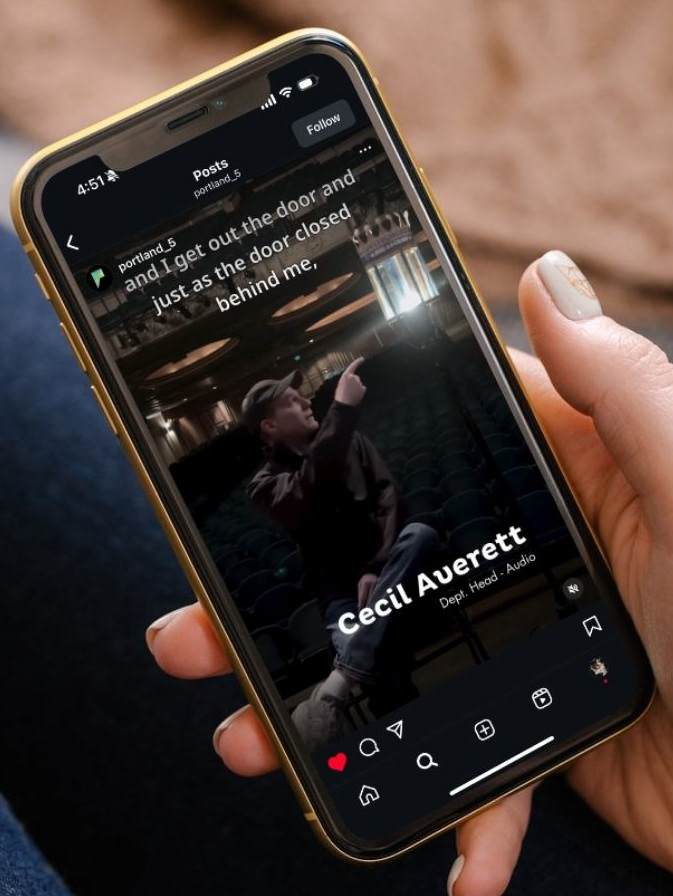
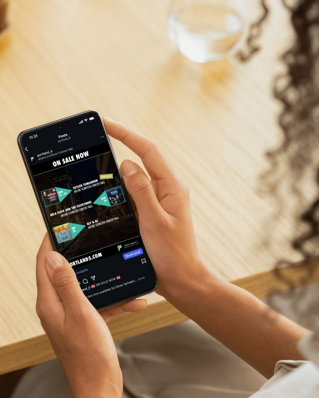
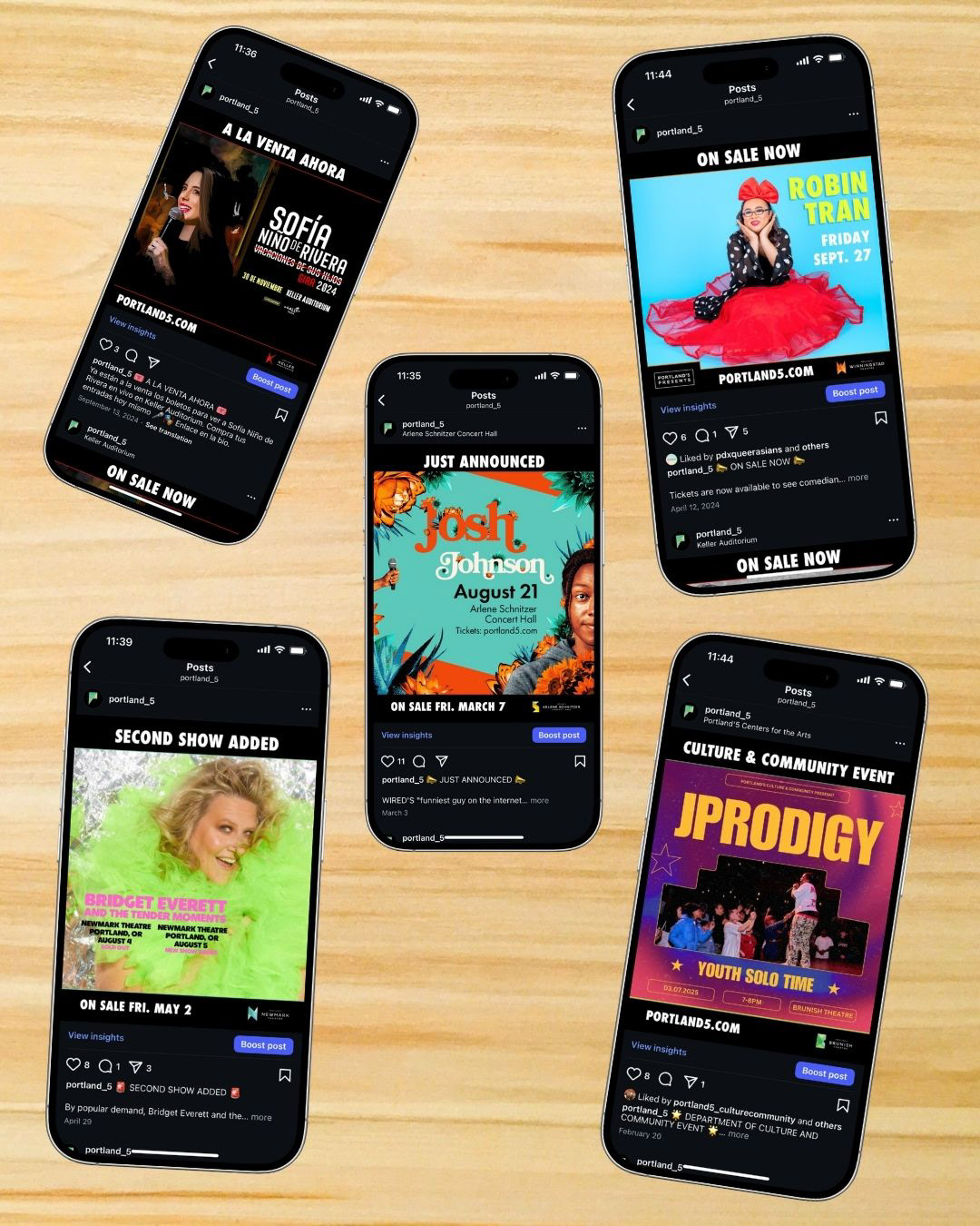
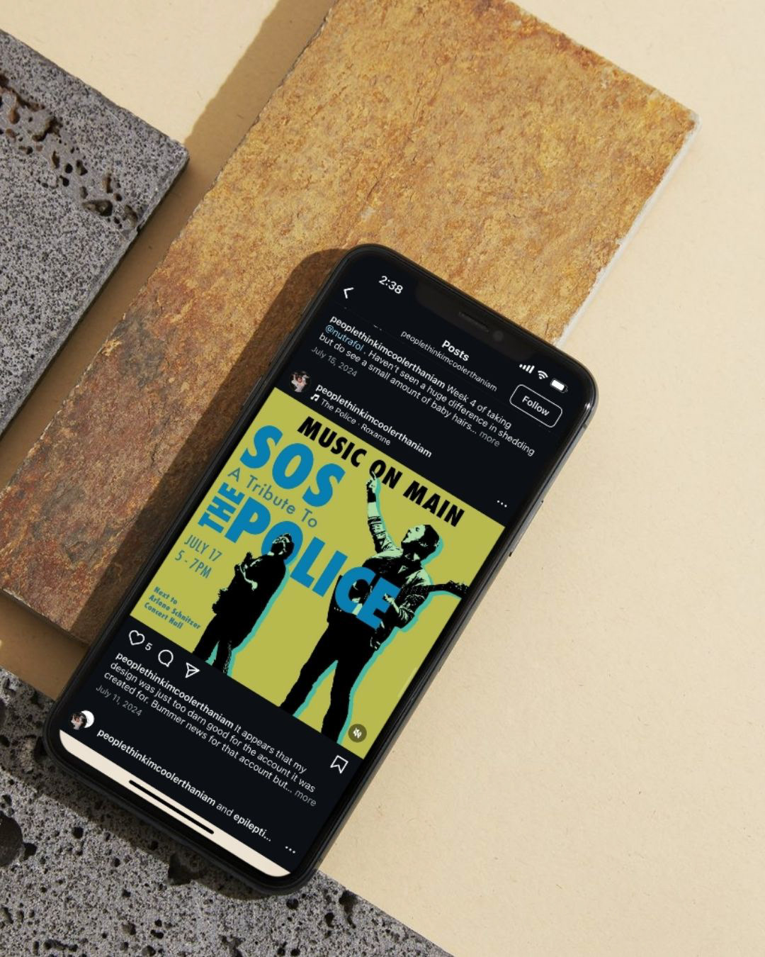
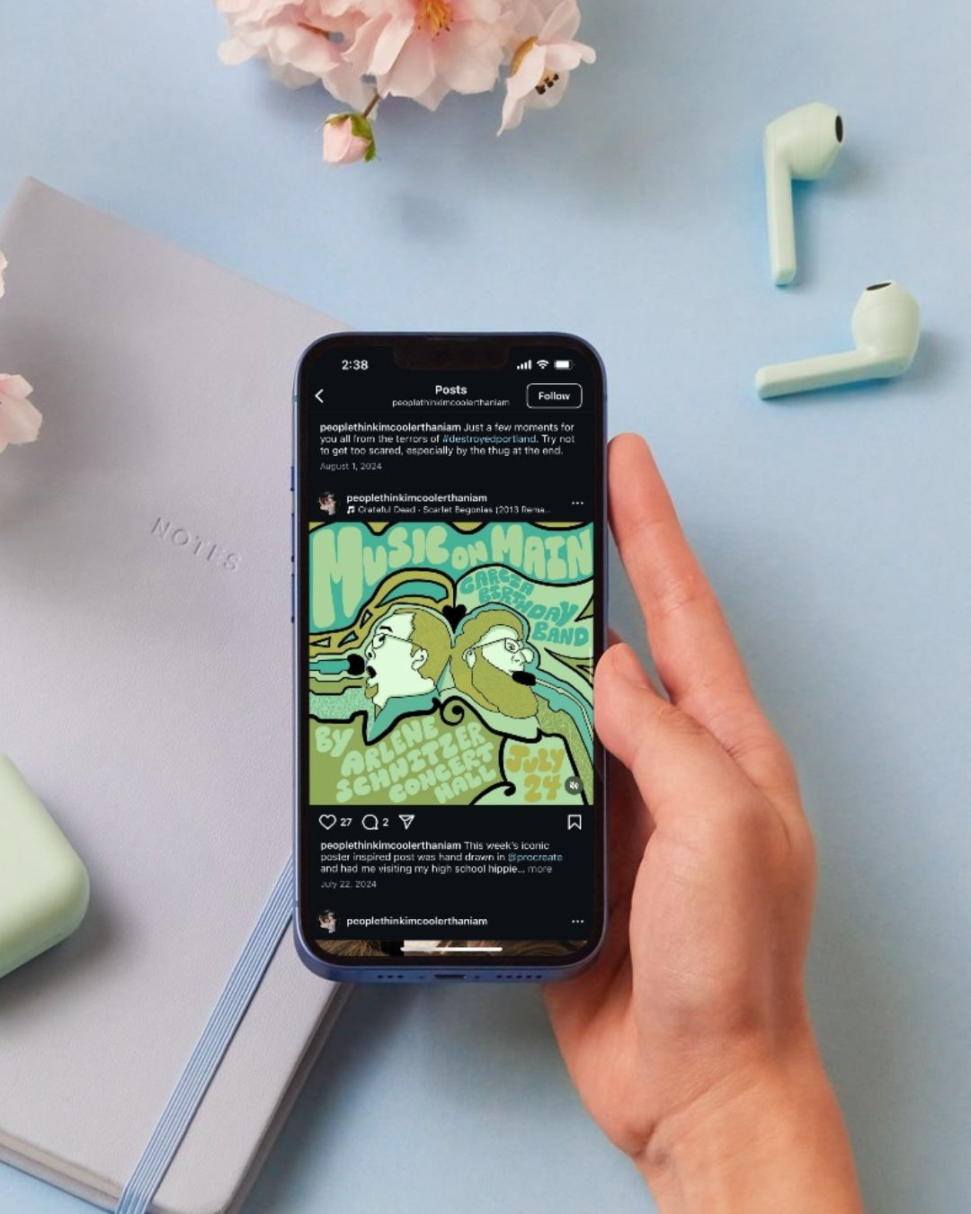
Historically, Portland'5 social media content consisted of imagery provided by artist tours with little to no branding that signified affiliation with the organization. Using Procreate, Photoshop, and Canva, I crafted branded social media templates and artwork that developed cohesion, making it easy to identify which venue performers were coming to, and encouraging viewers to stop scrolling and learn about upcoming performances. These steps resulted in a 70% increase in organic impressions, a 71% rise in clicks, and an 11% growth in audience size.
Presentation Design
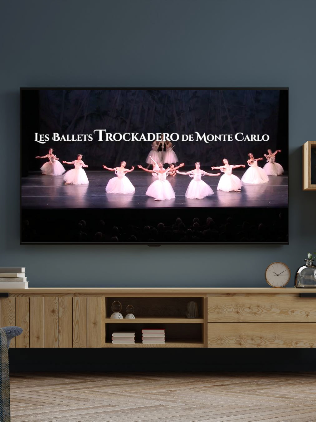
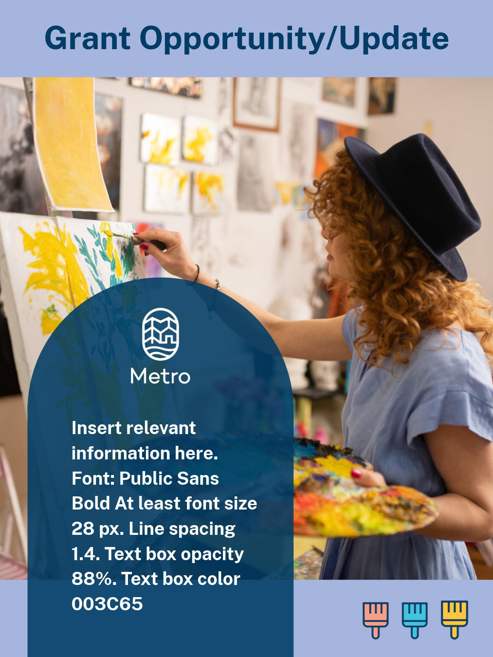
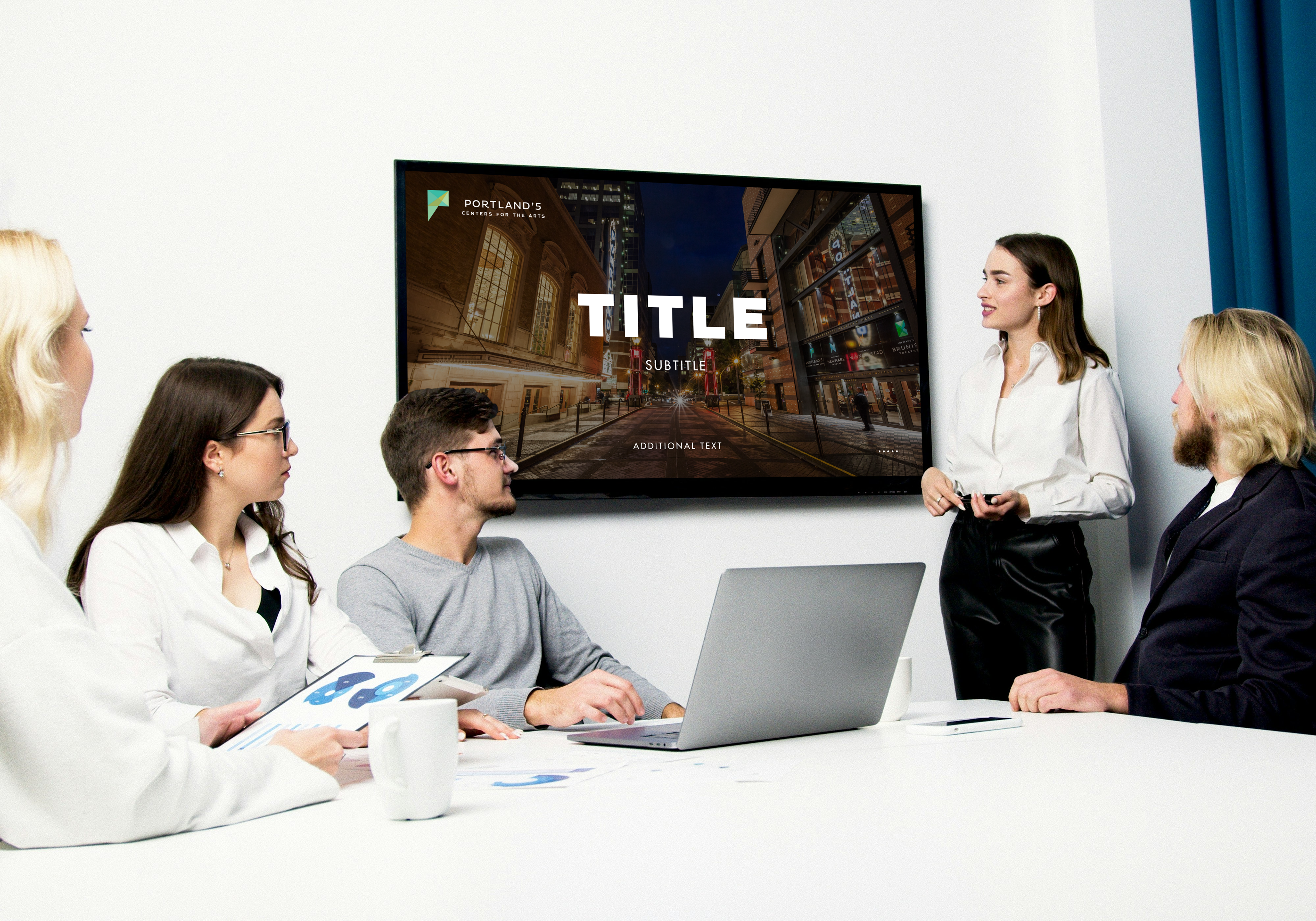
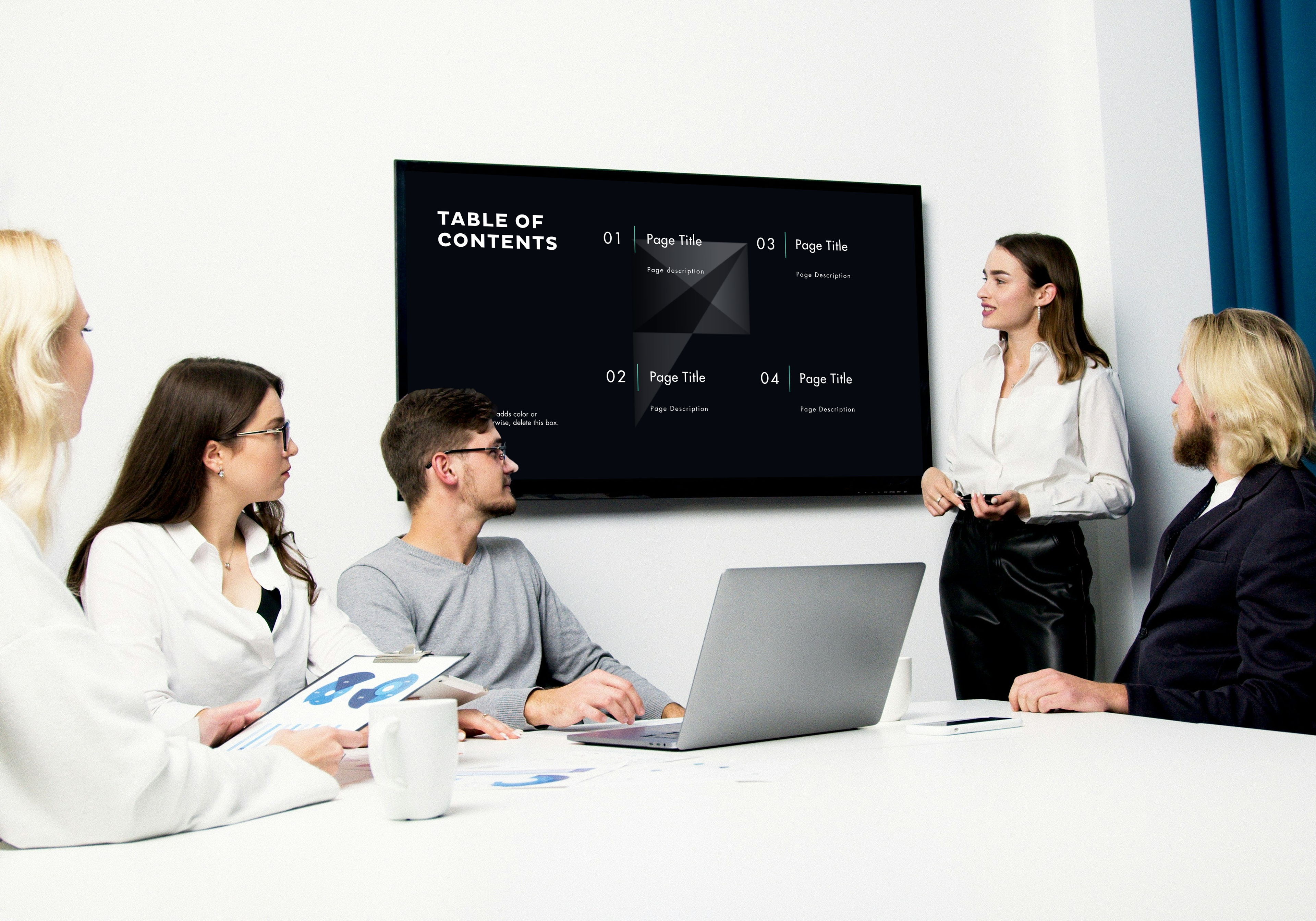
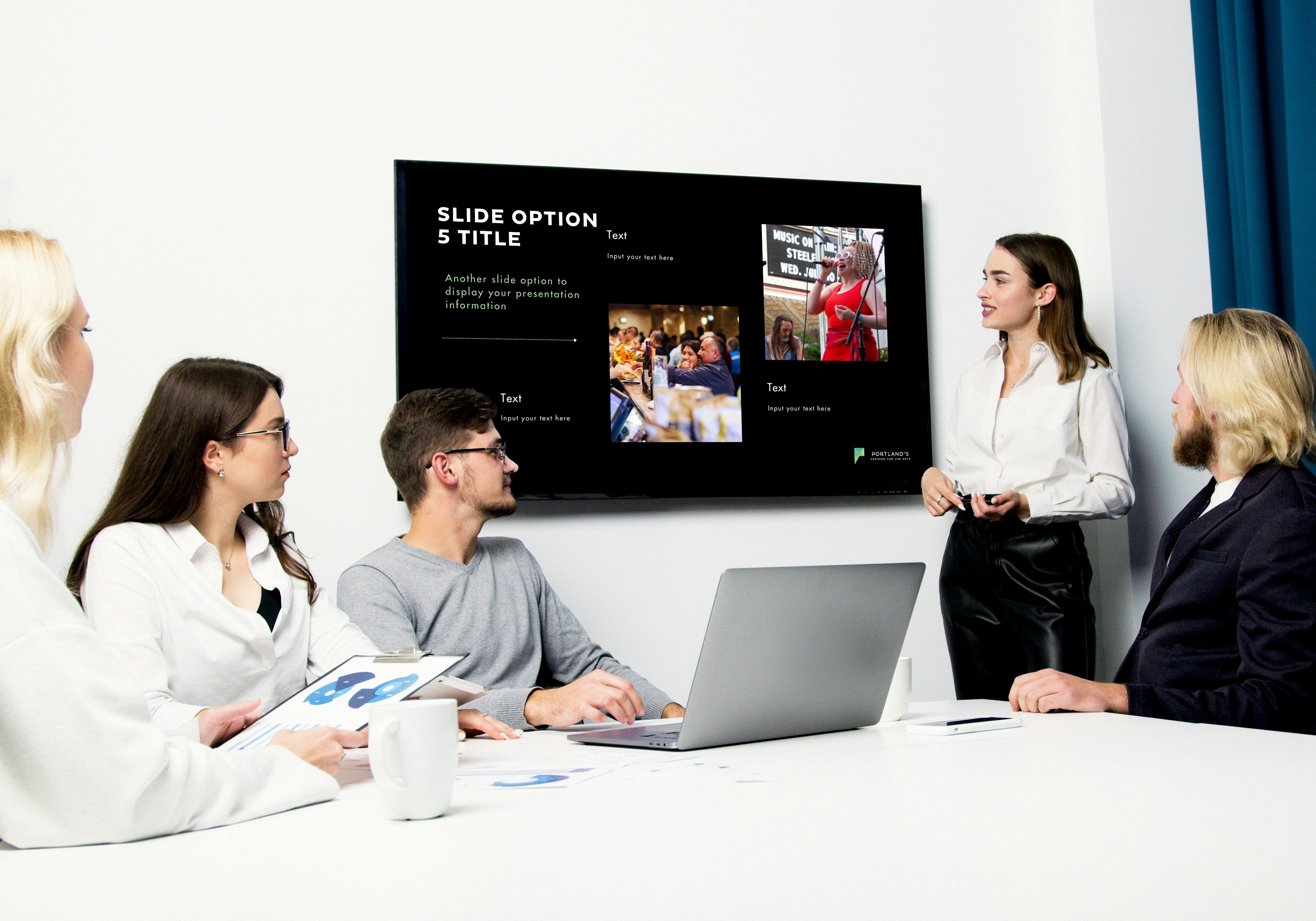
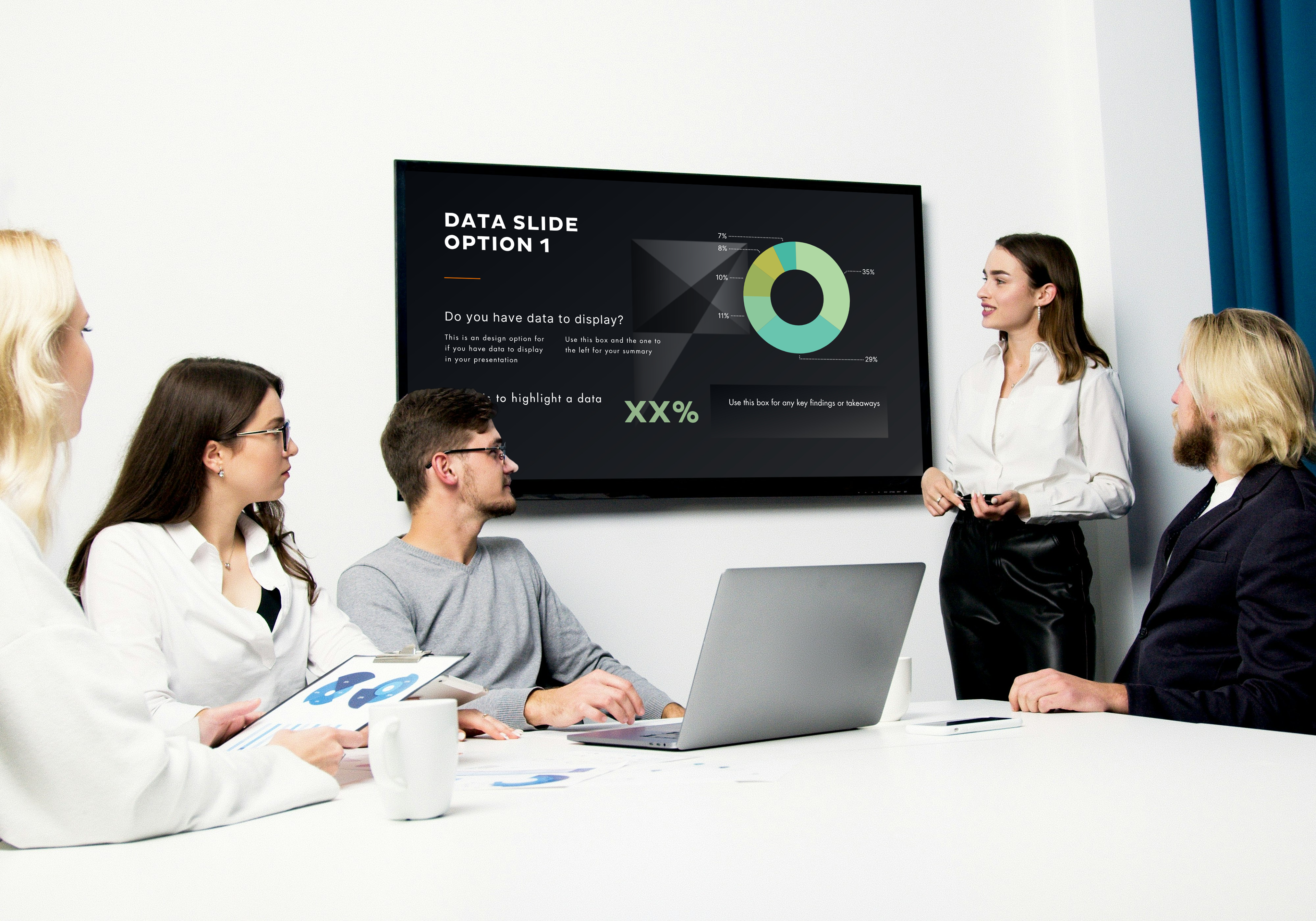
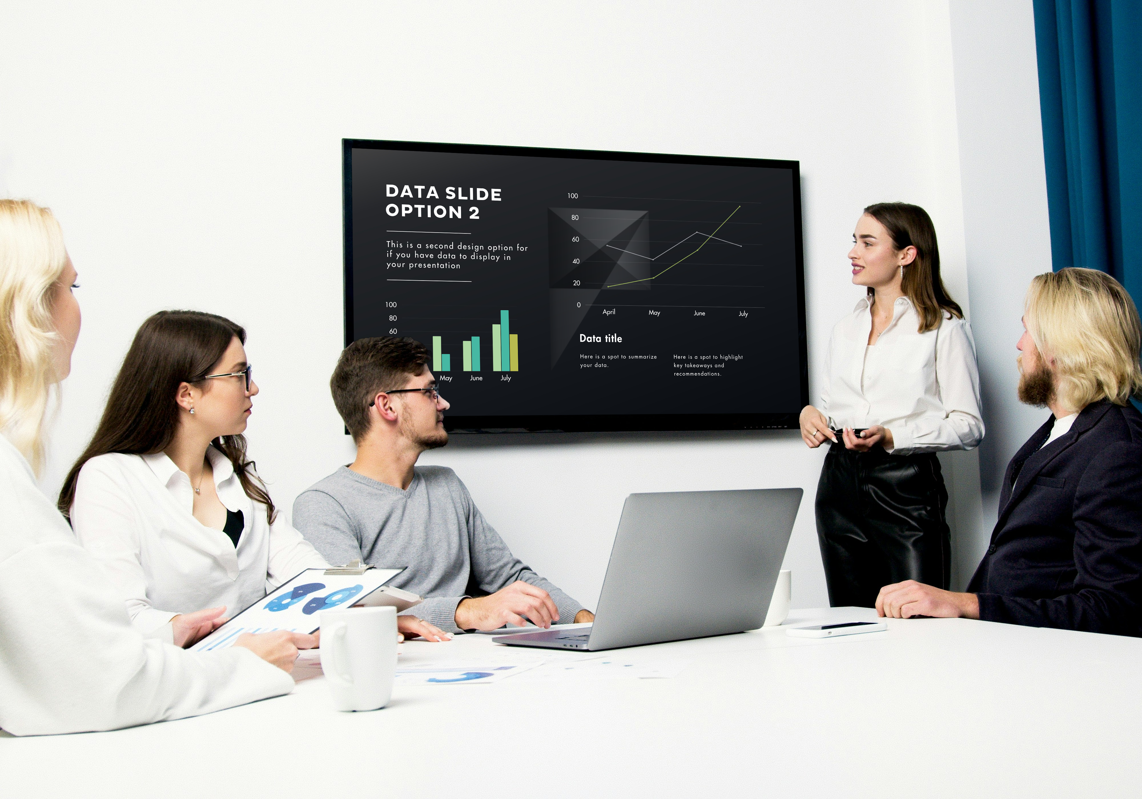
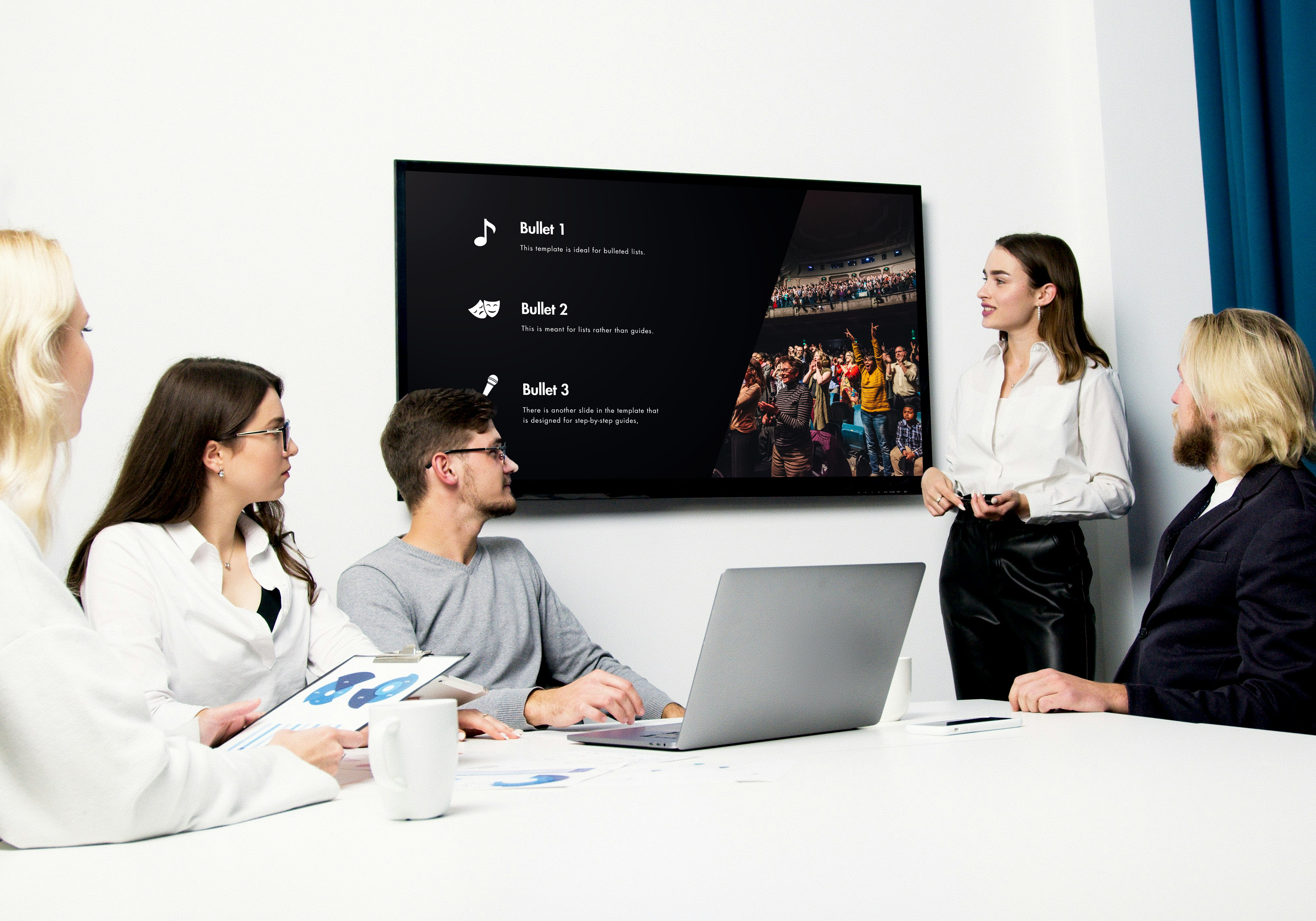
These are some more actual humans (who are definitely not stock images) enthralled with one of the design templates I created for Portland'5 presentations. Just look at how mesmerized they are! Using PowerPoint and Canva, I created branded presentation templates to ensure that everything, from volunteer trainings to reports from the Executive Director, remained true to the overarching brand.
Pins!
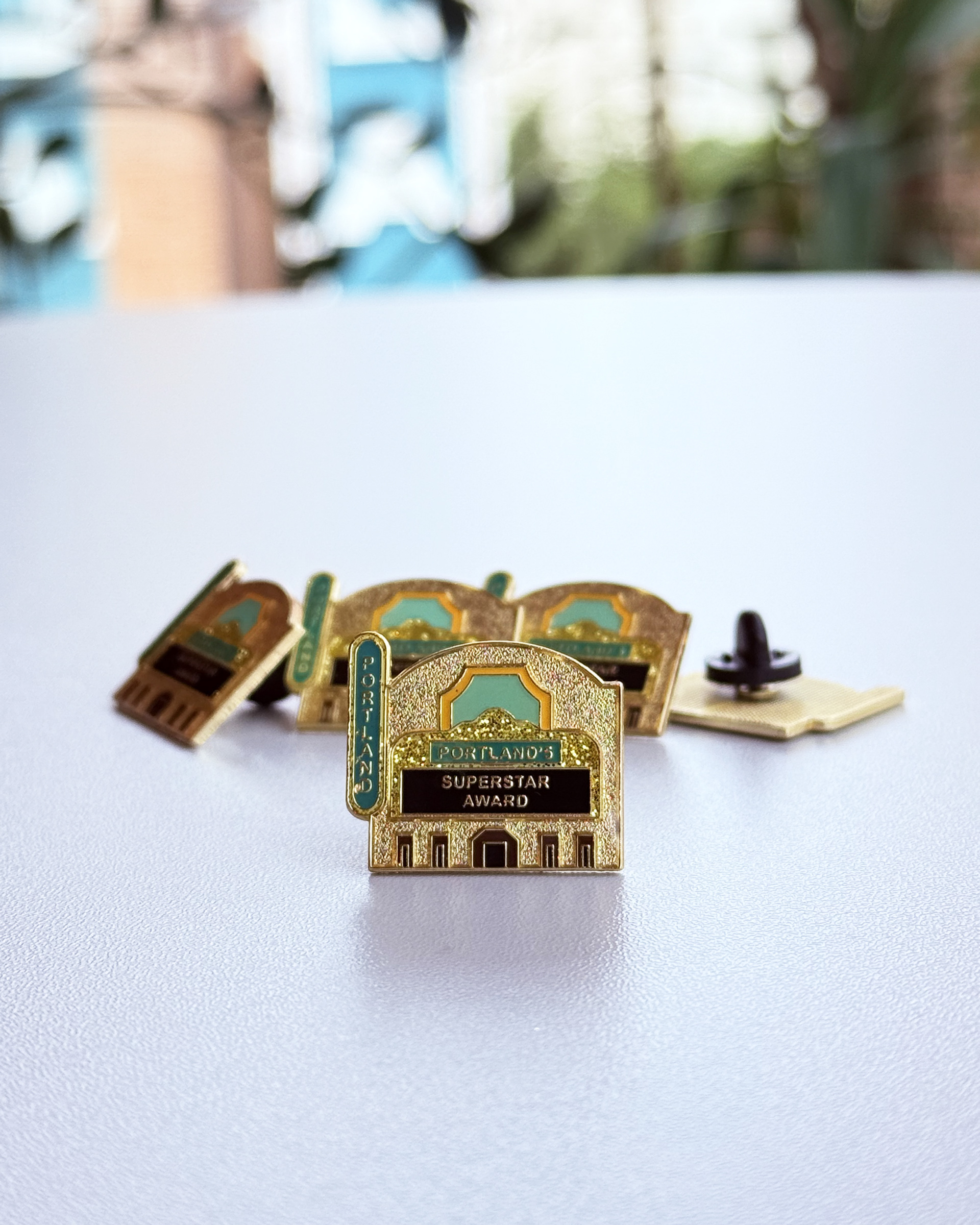
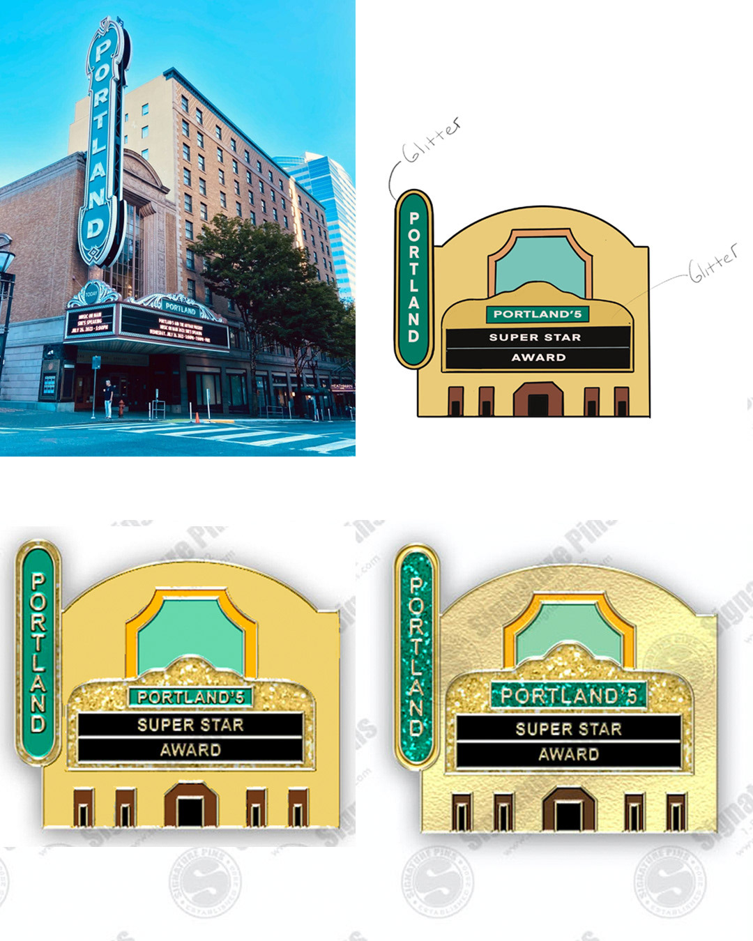
When tasked with designing a pin as part of an employee recognition program for Portland'5, I featured the historic Arlene Schnitzer Concert Hall, with its iconic "Portland" sign. I used Procreate to create a simplified version of the building with the "Superstar Award" listed on the marquee. Working with a vendor to fine-tune the layout and color, I selected a final product featuring recessed, sandblasted gold metal to reflect the texture of the building. The design incorporated accents of traditional colors, polished gold metal, and glitter, creating a final product that any staff member would be proud to wear.
Auto-populating Pre-performance Emails
In addition to designing and managing day-to-day email correspondence with audiences and prospective ticket buyers, I designed and directed the development of auto-populating emails to go out to ticket holders prior to their arrival at performances. The emails were unique to each of the five venue sub-brands, and the coding wizards at our partner Paciolan worked their magic, ensuring each email was personalized and included the correct information for each unique performance.
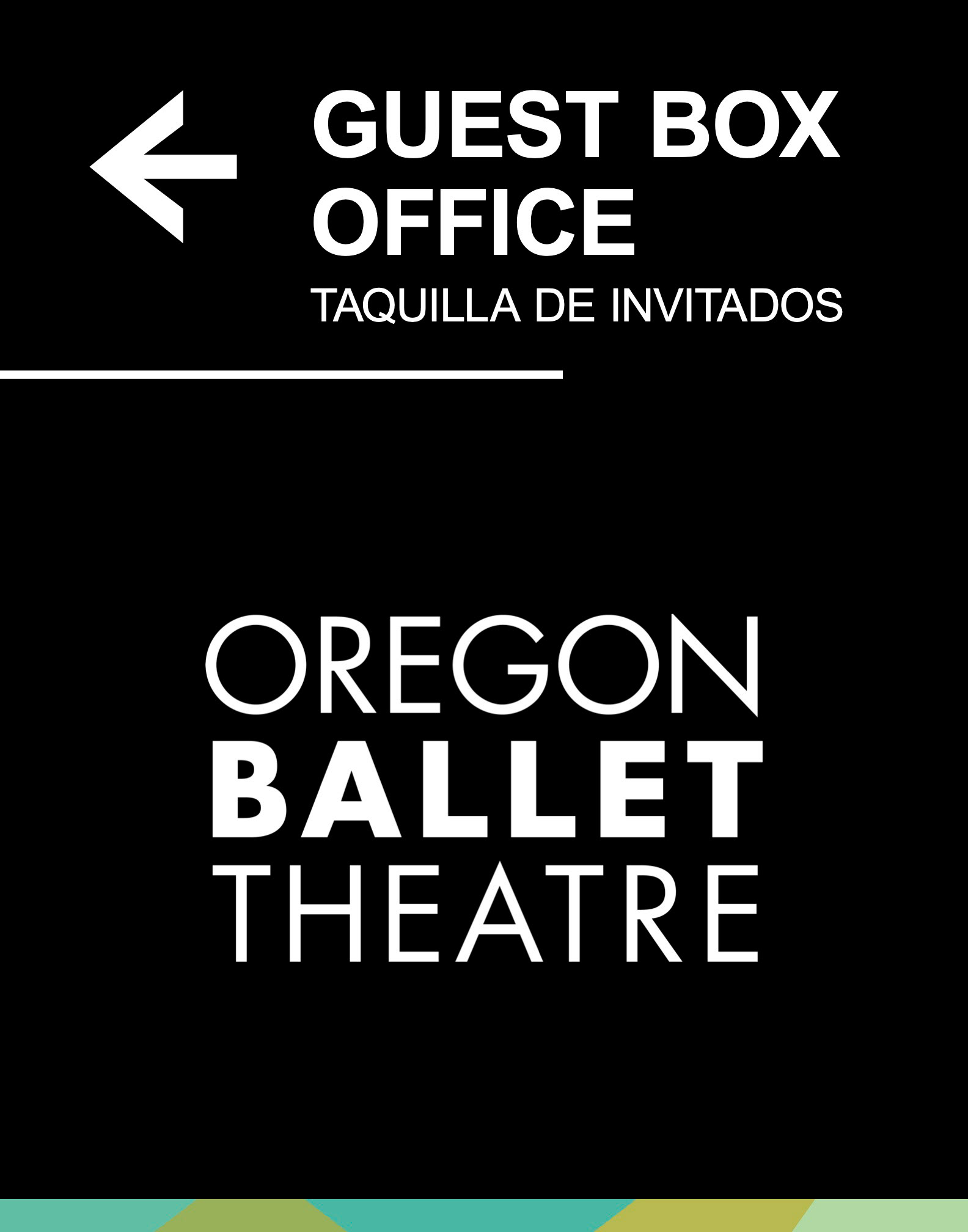
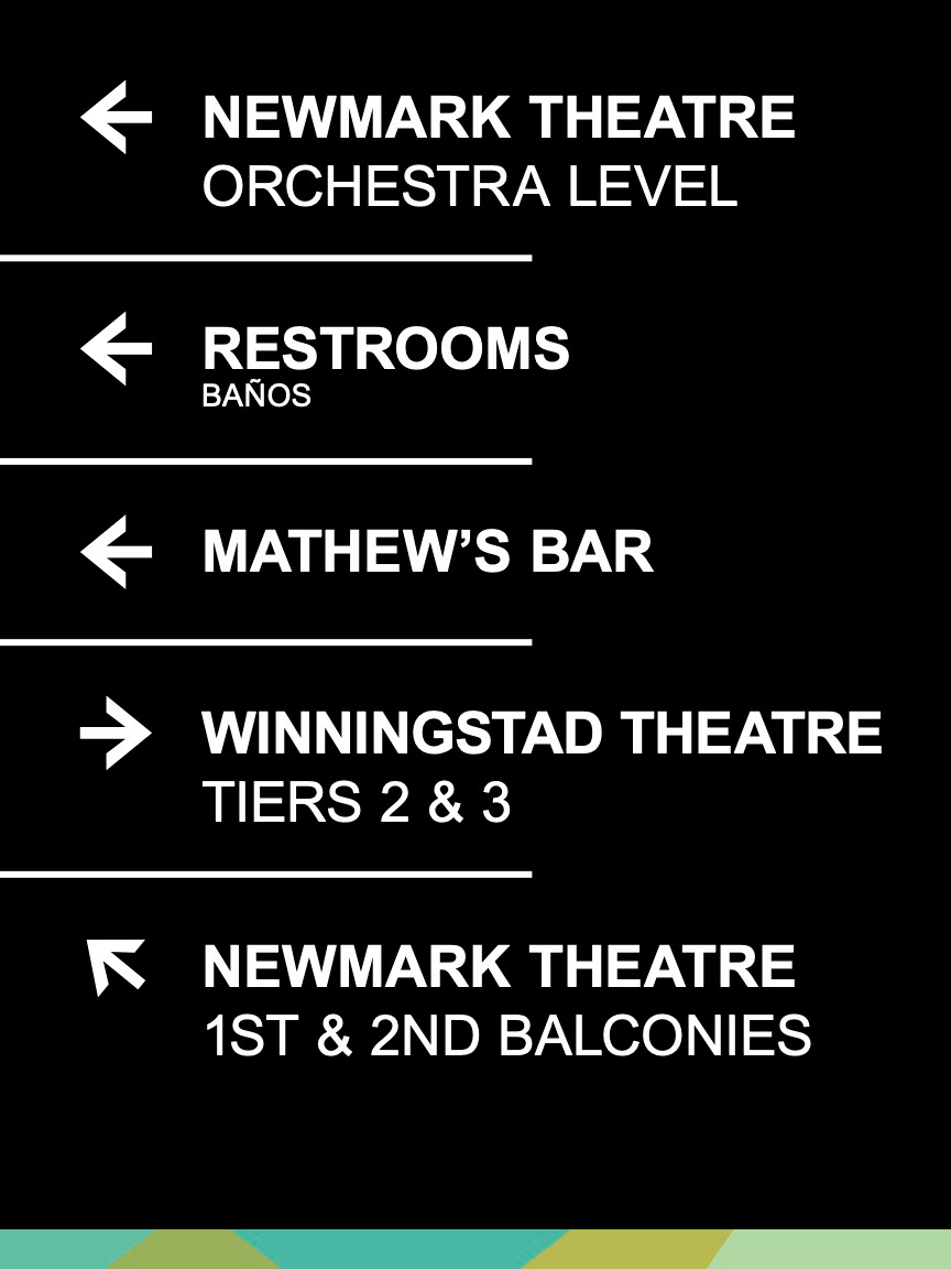
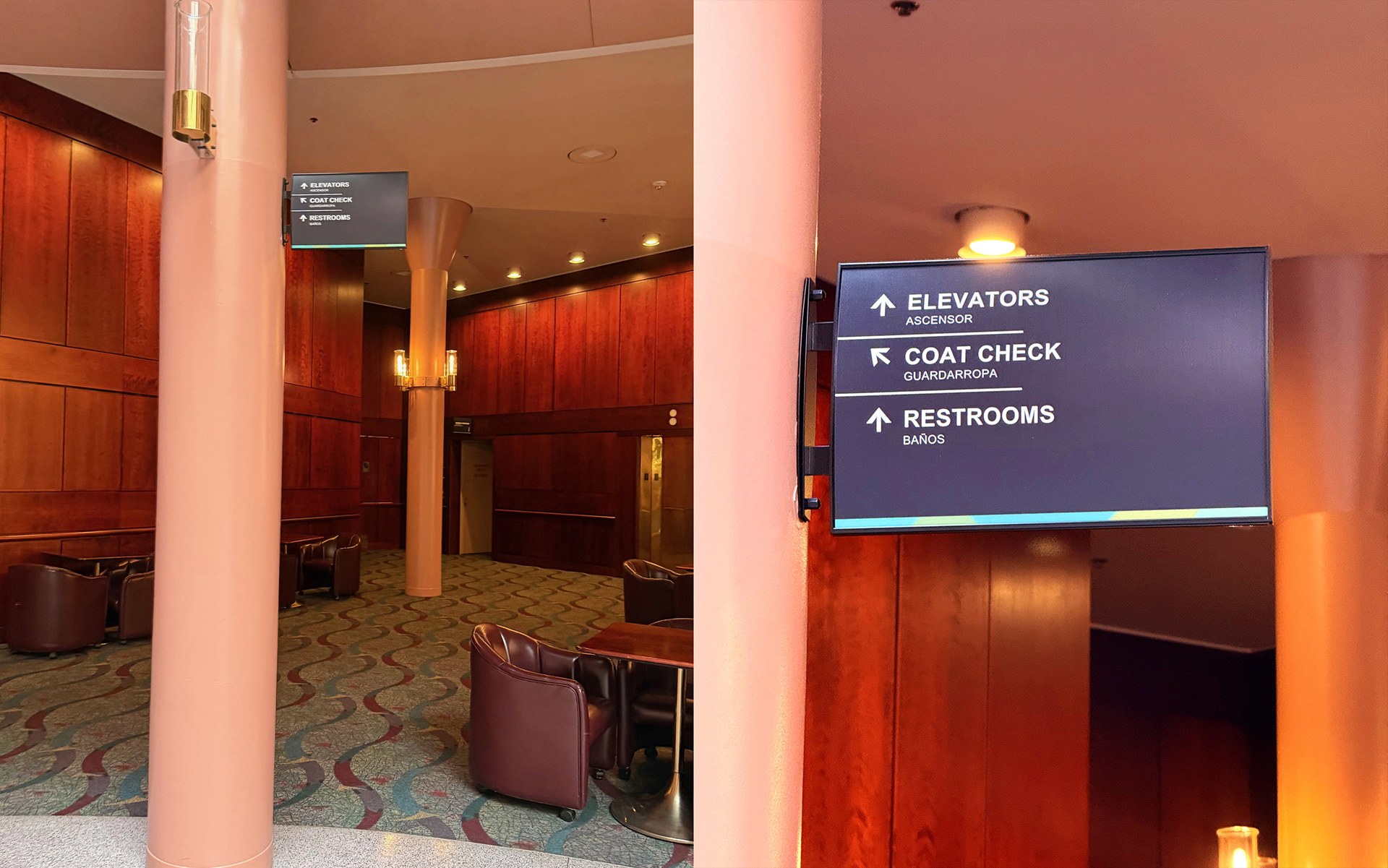
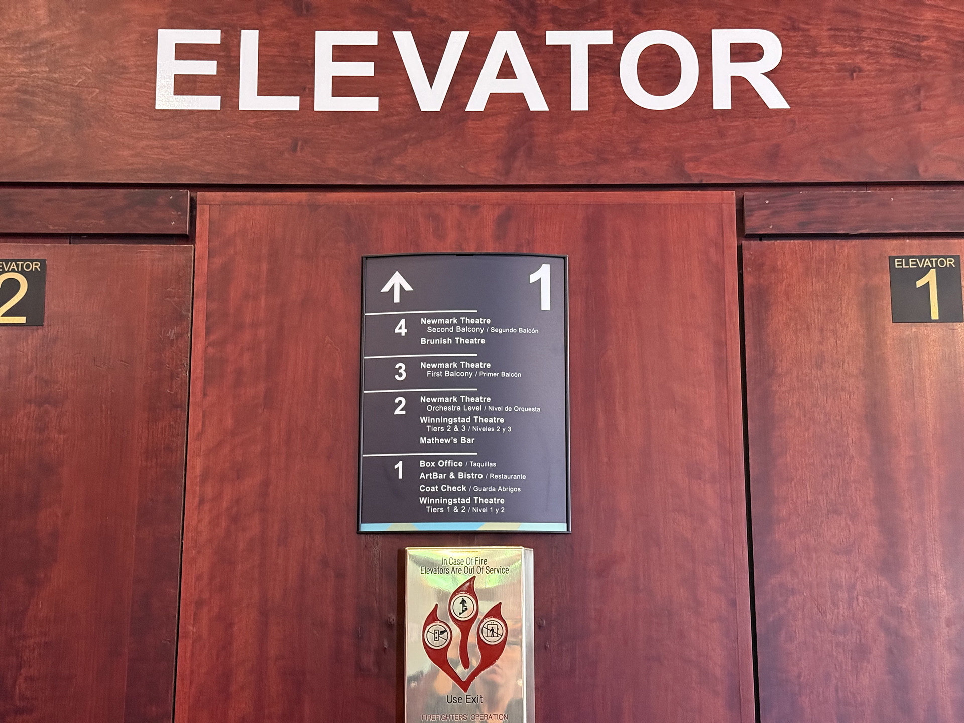
Creative Direction: Way-finding Signage
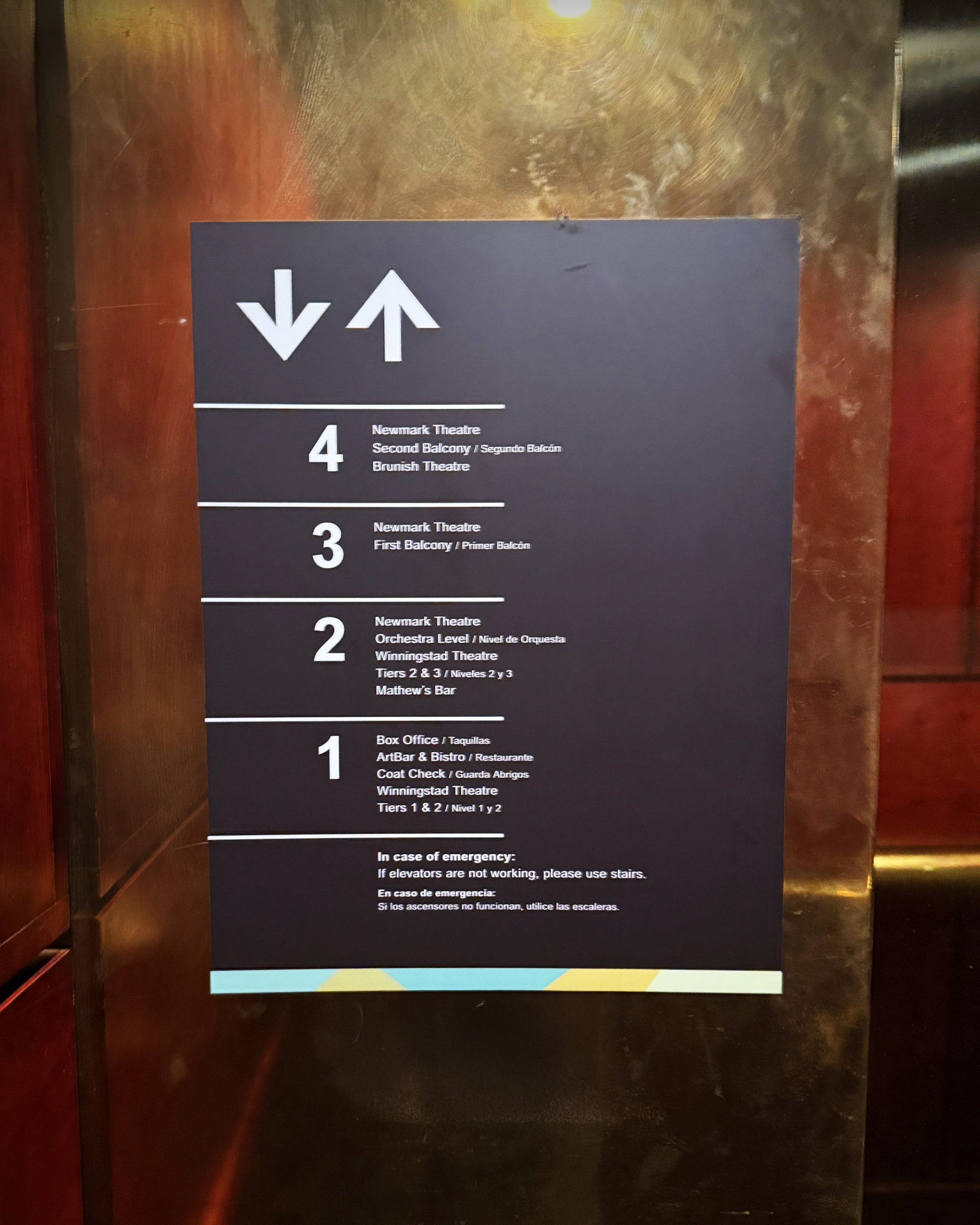
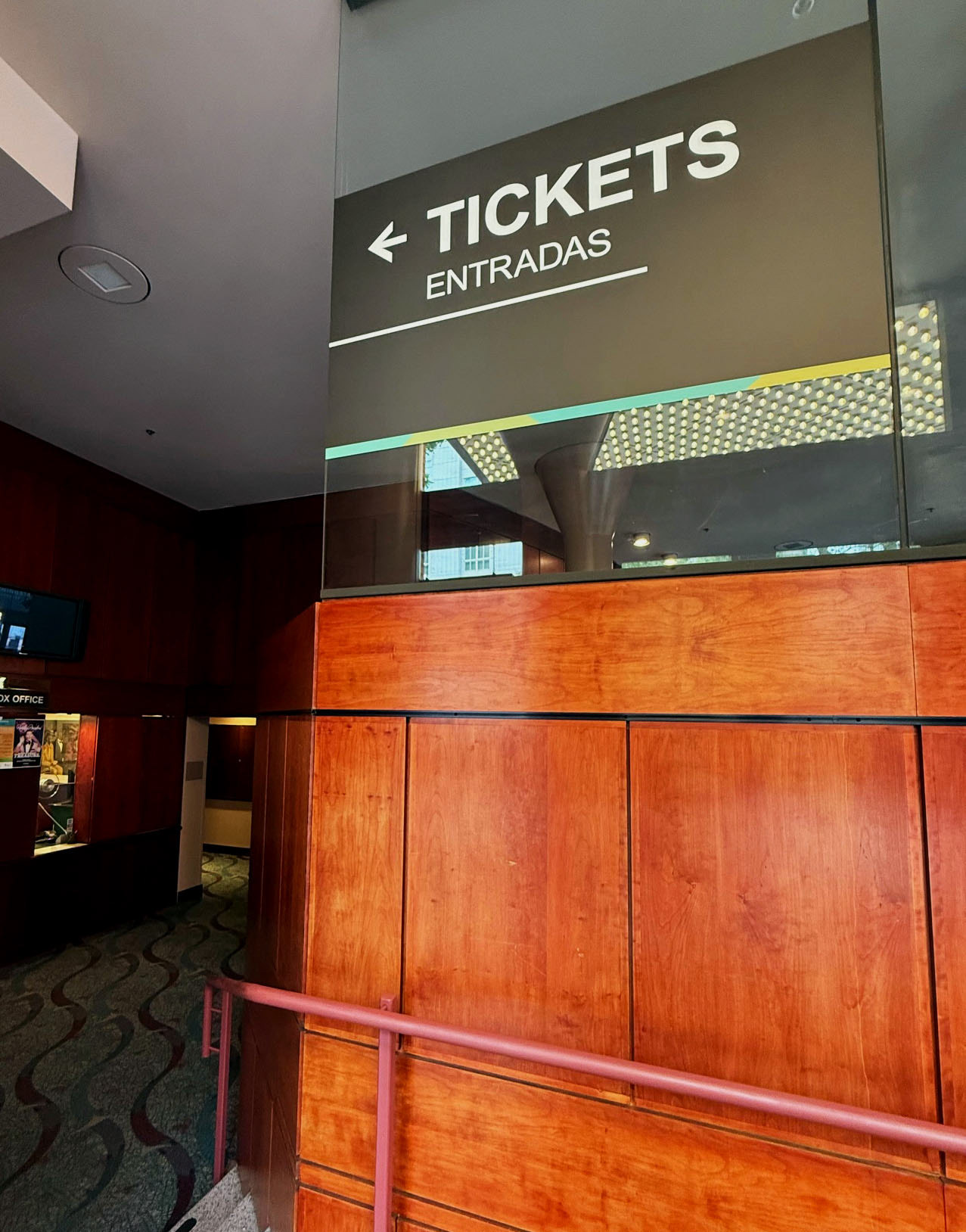
During an initiative to refresh the way-finding signage in a building housing three unique theaters, I took the role of Creative Director. I led external design partners through the ideation and selection of signage that balanced functionality with brand identity. At project launch, the organization's leadership was holding discussions about updating the interior of the building. I positioned the signage as the first step in modernizing the space and making it more representative of the brand. By selecting colors and shapes pulled from the logo and fonts directly from the organization's brand kit, the new signage not only improved navigation for guests but also reinforced a cohesive visual identity throughout the venue. This project has set the tone for future interior updates, creating a seamless brand experience from the moment patrons walk through the doors.
